Enhancing a product for the next phase
A subsidiary for Amerisourcebergen, IntrinsiQ / PME offers cloud based products to help oncologists locate the most up-to-date data on cancer focused therapies and assist in finding potential treatments for their patients. In 2022, a pilot program was released with a select group of users, and I was asked to help with preparing the application for the next phase which included making it more scalable, rethinking the information architecture, working with other design teams to align with Amerisourcebergen branding styles and updating the flows and visual designs.
Project Overview
Contract Duration: 4 months
The oncologist software was in a Beta state and being shown to potential stakeholders for buy-in, so it was important to improve the design of the software with a more user-friendly and effective interface for medical professionals. This involved making it responsive across various devices, restructuring and simplifying the navigation and work-flows, enhancing functionality to boost efficiency, and developing a consistent visual language that integrated well with the design system of other applications.
My Role
My role as the sole UX designer involved updating existing designs for future implementation, developing new file structures and deliverable methodologies, integrating the design system to create standardized components, modernizing the interface with fresh visuals, establishing a new information architecture, restructuring the application into logical groupings, creating user persona's to identify user needs, and streamlining work-flows for a simpler and more intuitive experience.
Challenges
Redesigning the original web application presented numerous challenges that required a strategic approach. Issues like non-responsive design, complex and confusing work-flows, a lack of adherence to the parent company's design system, inadequate adherence to UX best practices, and an outdated UI visual design demanded a holistic approach to the complete application. Dense content, minimal user research and poor file management, also added complexity to the task.
Approach and Solutions
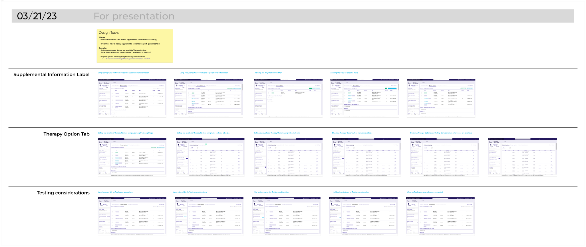
After conducting an in-depth UX audit of the existing design to identify inconsistencies and pain points, I collaborated with stakeholders to understand their needs and expectations. Two common themes that came up from the PM team and Engineering team was that it was difficult to locate current designs, and to understand at what stage those designs were in. So one of my first efforts was to establish a new Figma organization method and file structure for design deliverables. This immediately resulted in far less confusion and better self-service.
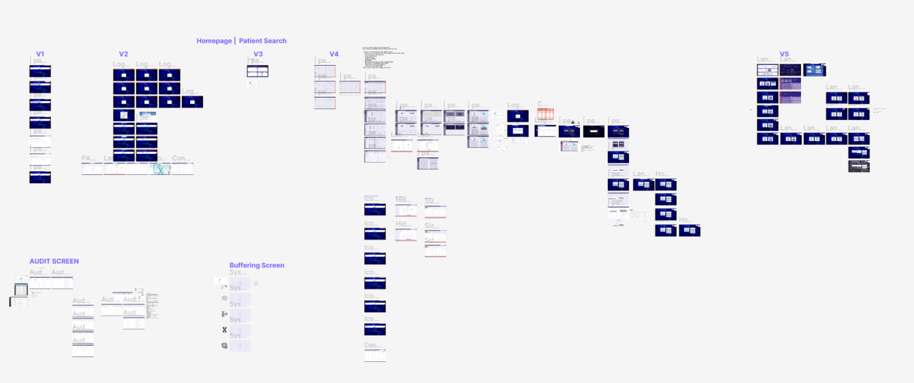
Example of old Figma page
Original Figma files were not organized and difficult for stakeholders to locate needed designs
Restructured Figma Files
-
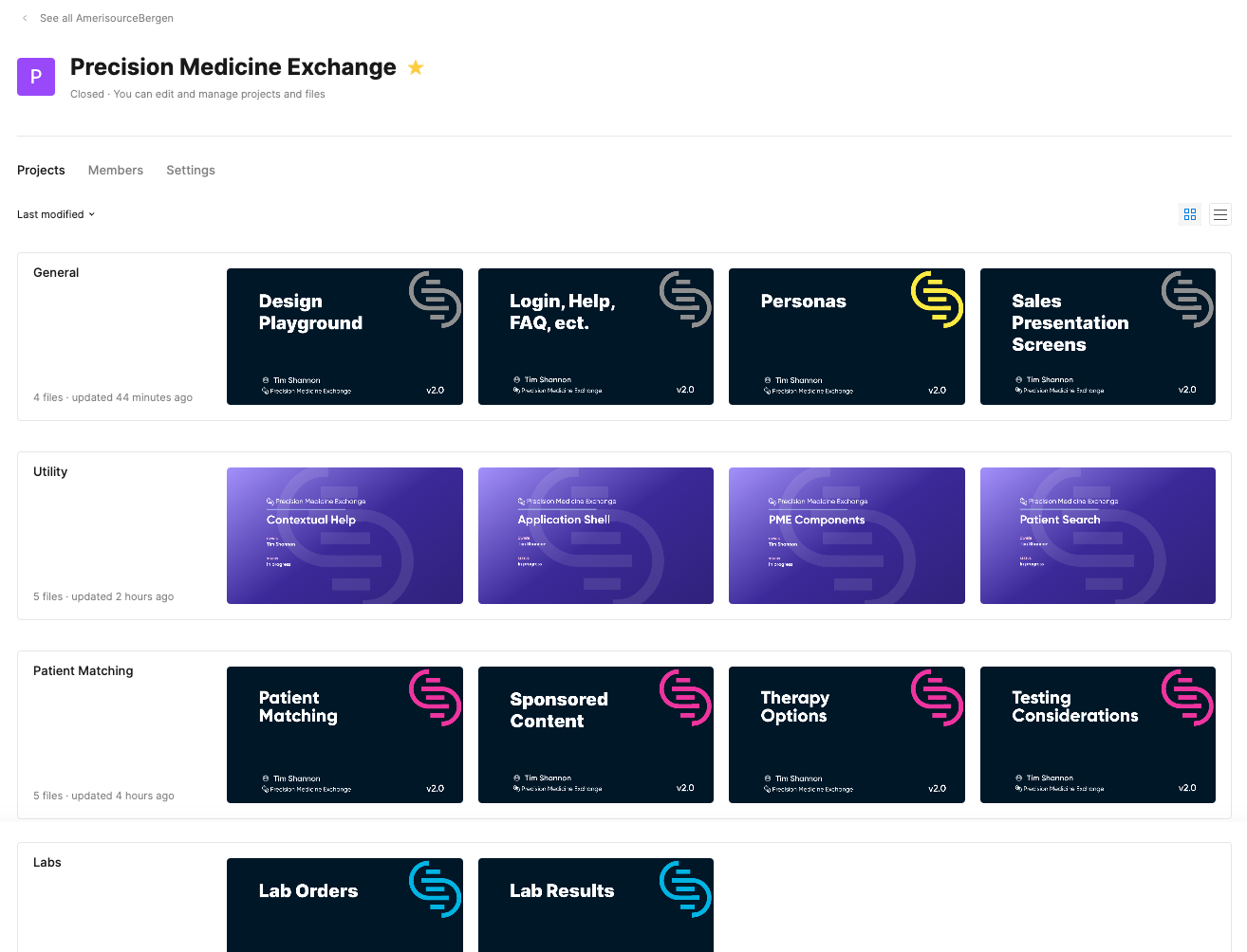
New Project Organization
Logical groupings of application segments and business structures were divided into separate projects so appropriate teams could locate the needed designs quicker.
-
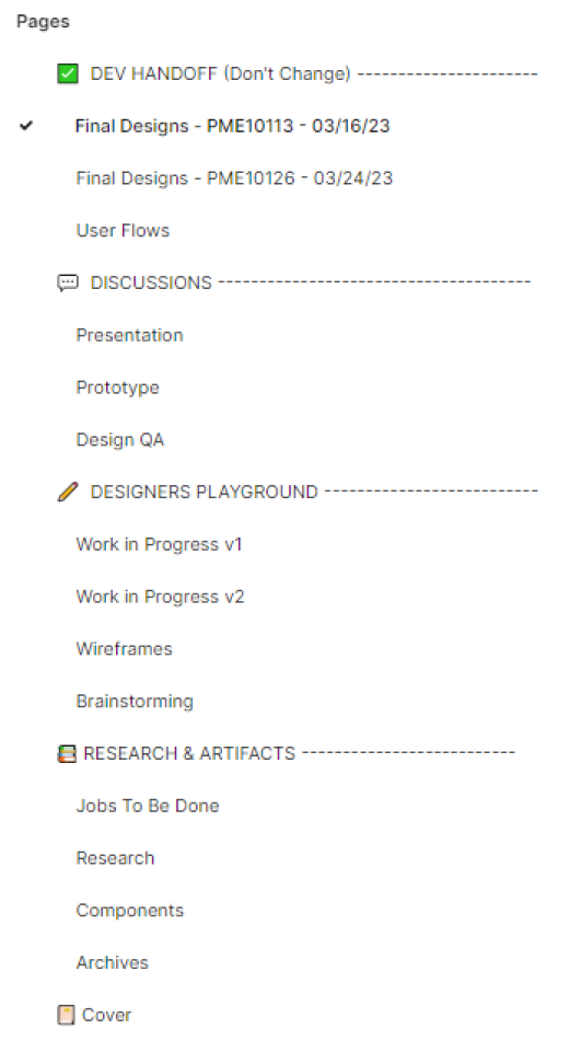
New Page Structure
I created a custom Figma plug-in so all files had the same page scaffolding allowing stakeholders to know exactly what the purpose of each design was. Deliverables were labeled with the Azure DevOps User Story, allowing for confident self-service.
-
New Design Structure
Designs were laid out with logical horizontal and vertical groupings and labeled with dates and purpose.
Finding immediate solutions for a quick impact
The next step was to fix the immediate design issues on the UI such as inconsistent formatting, inconsistent colors, lack of responsive design and a lack of adhesion to the parent company design system. I connected with designers from other divisions of the parent company to get appropriate direction on using the design system and then worked with the engineers to build out a set of common components and responsive page structures using the Tailwind CSS framework. This allowed me to create effective designs without much engineering overhead.
Evaluating Layout issues
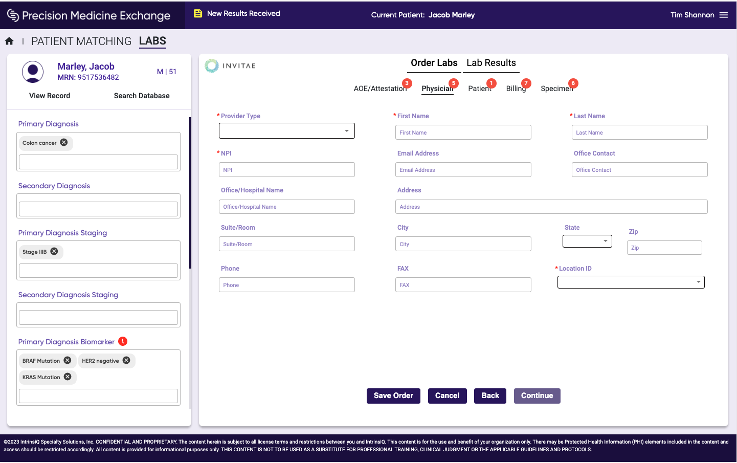
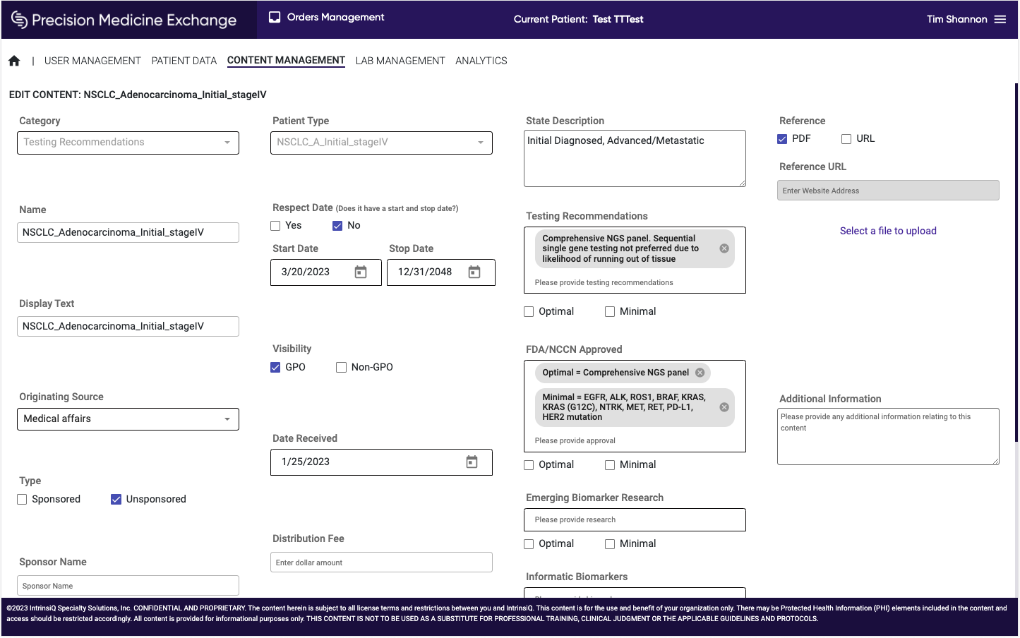
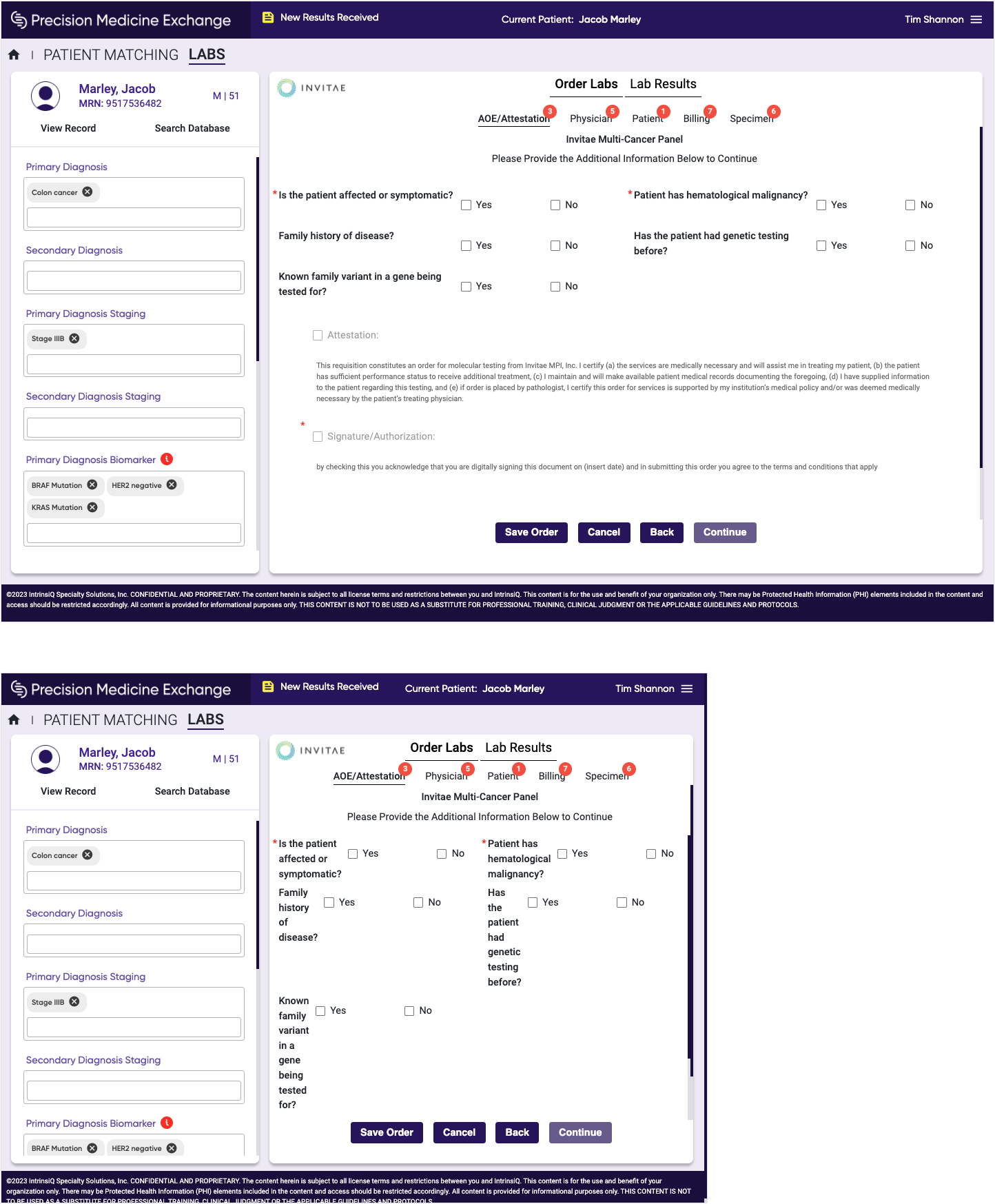
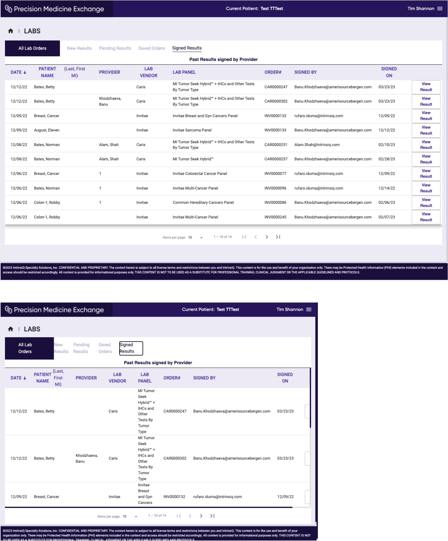
Spacing and wrapping issues made elements inconsistent in how they lined up. This was especially noticeable on forms.
There was also inconsistency with colors and component usage.
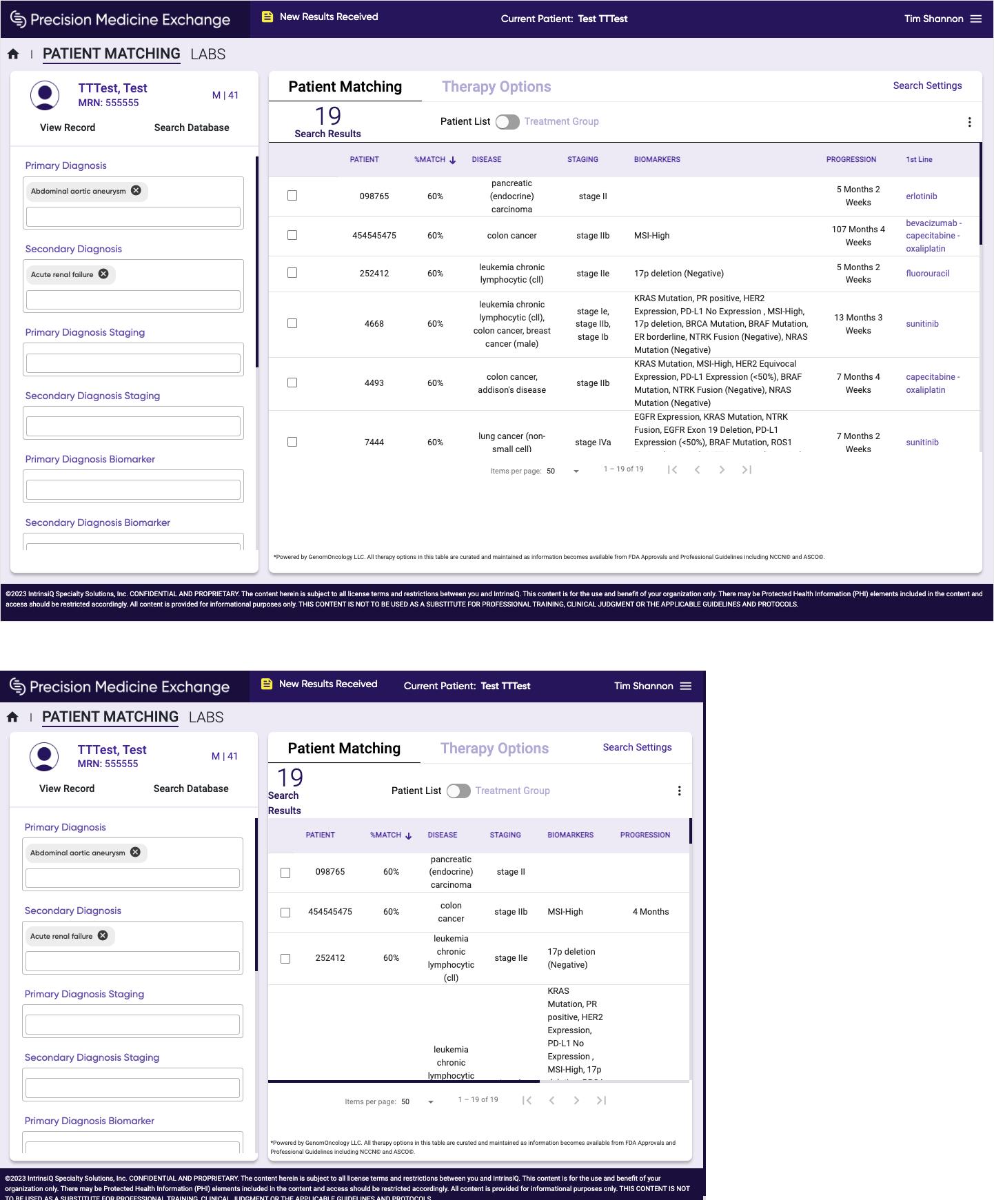
Evaluating Responsive issues
Although pages were technically "responsive", content and layouts didn't flow appropriately.
My quick impact solution
Aside from reorganizing and lining up content, I also used branded color blocks to help separate out areas within the application. However the "patient side panel" was a big challenge when viewing on smaller screens. During my research phase, I learned that the side panel is a "set and forget" control, and the patient data in that panel is automatically ported over from another application, so it rarely got touched. Therefore I proposed allowing the user to collapse the panel when not needed on larger screens and automatically collapsing it on smaller screens. This idea was a huge success with stakeholders and customer feedback was tremendously positive, as it allowed the critical content to be displayed more effectively.
Preparing for the next phase
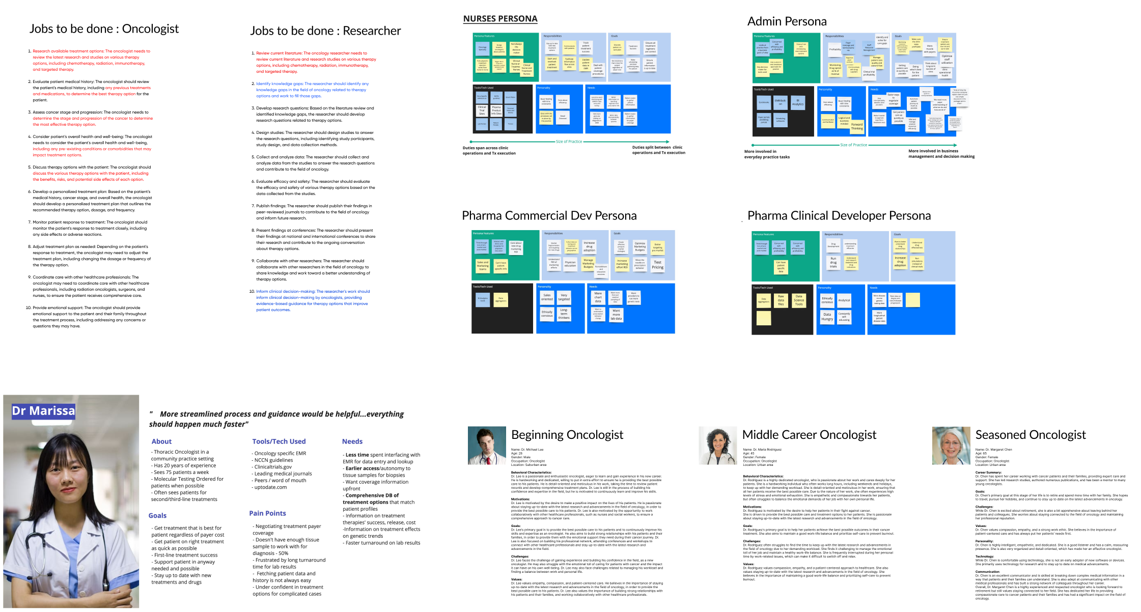
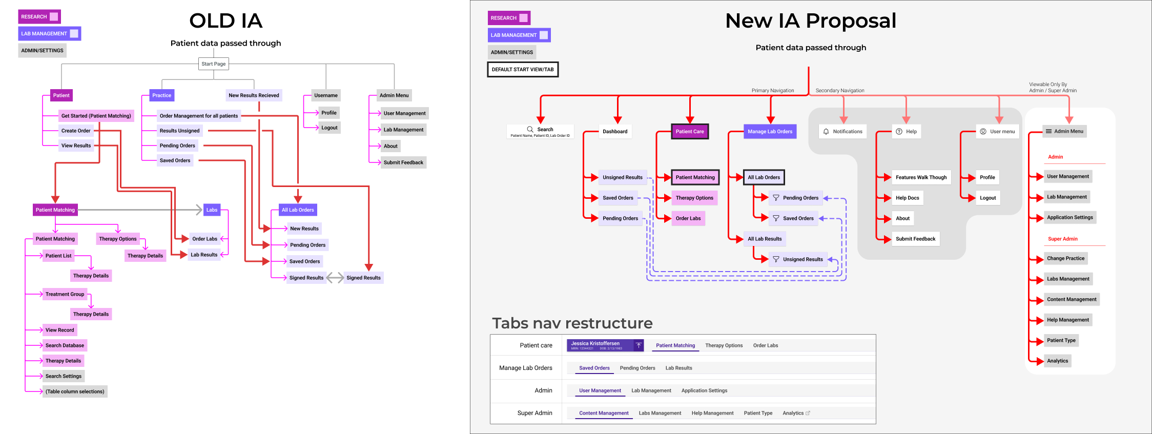
With the immediate issues resolved, I was able to dive into deeper UX research. Looking through internal documents, conducting customer interviews and exploring the medical ecosystem, I developed customer persona's and archetypes which allowed me to establish a jobs-to-be-done framework. Using the JTBD documents, I then looked at the Information Architecture and proposed changes to how the application navigation and content was grouped. This allowed me to start developing a long-term strategy for where I felt the application UX should go.
Final Design Deliverables
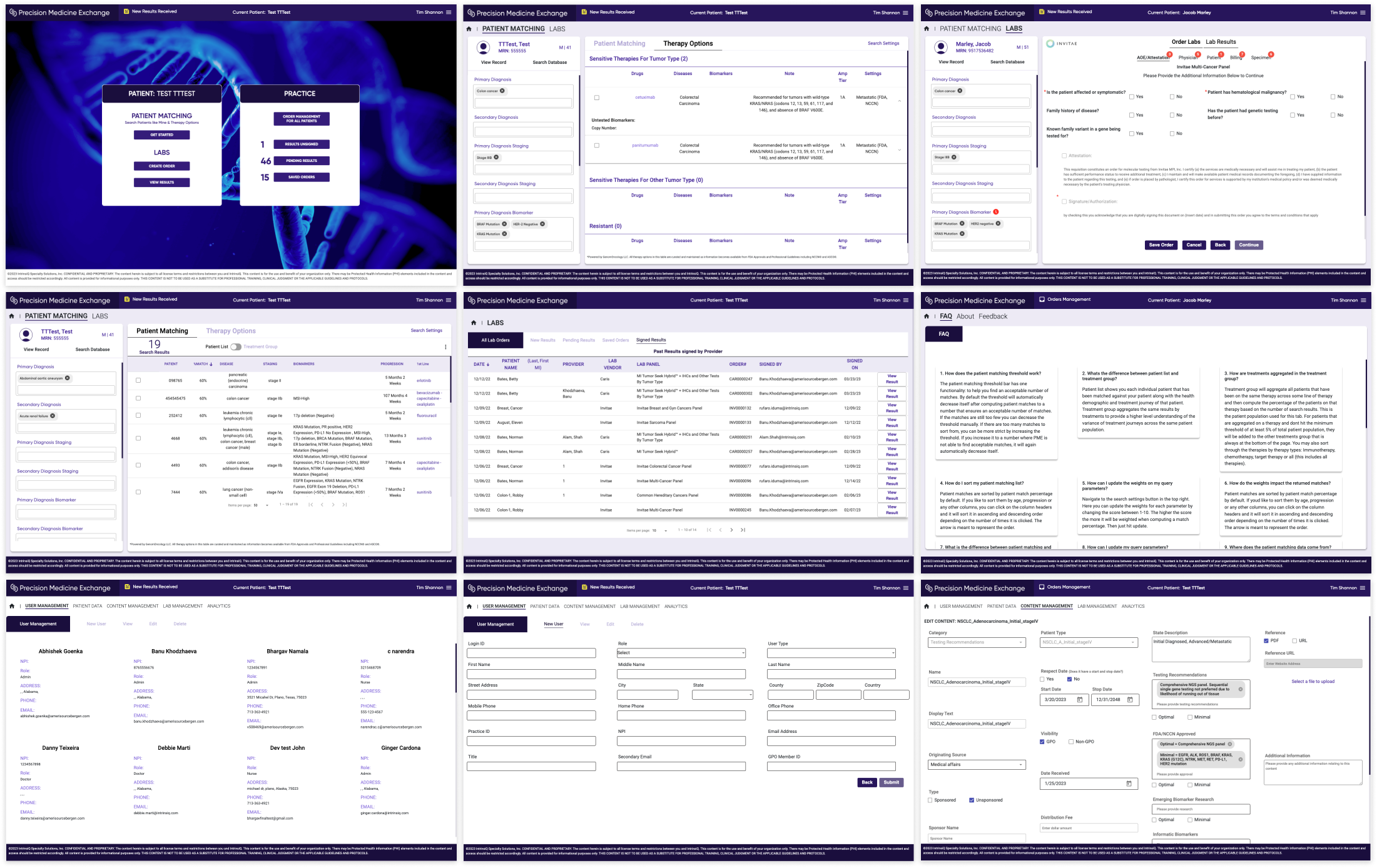
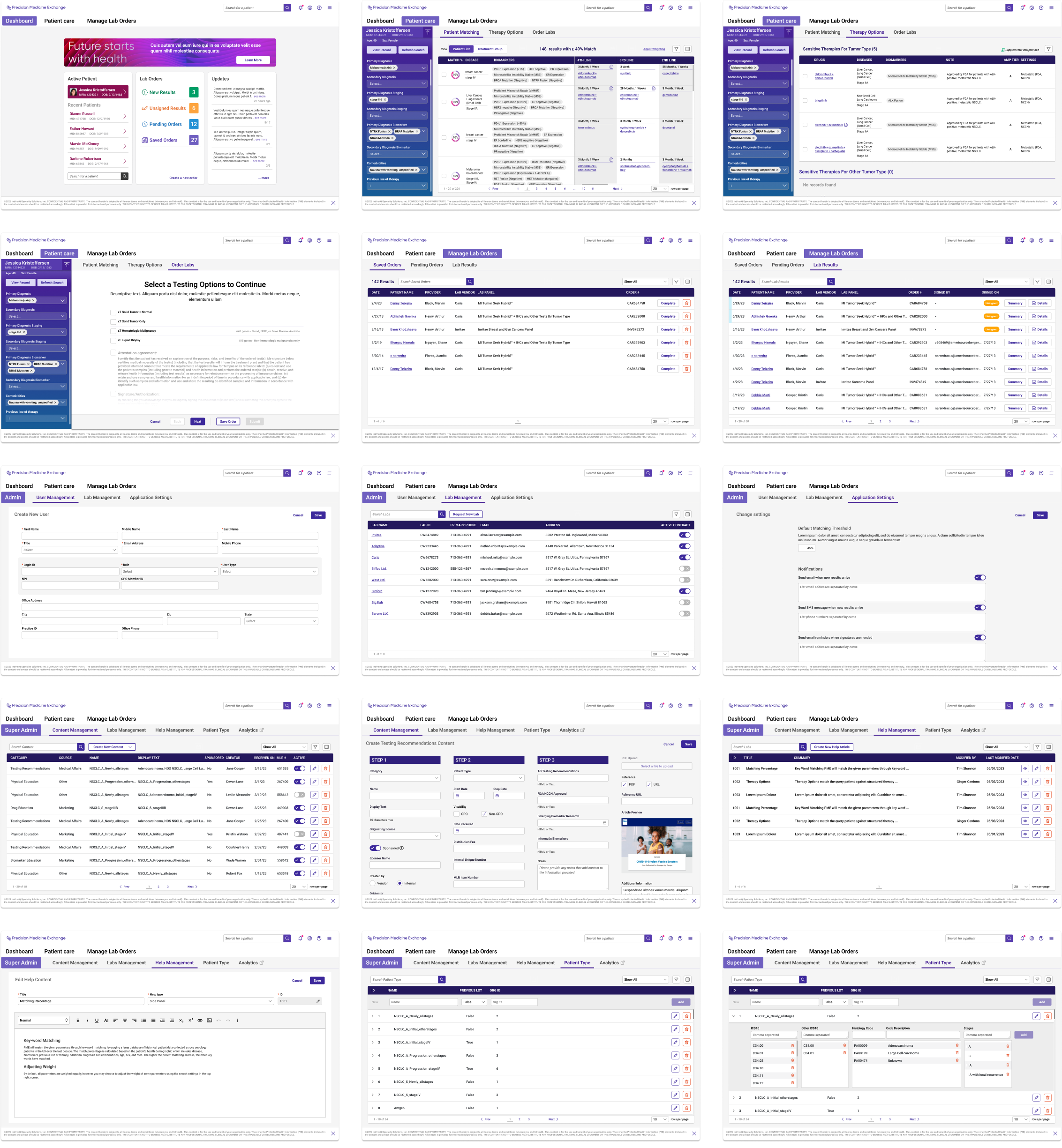
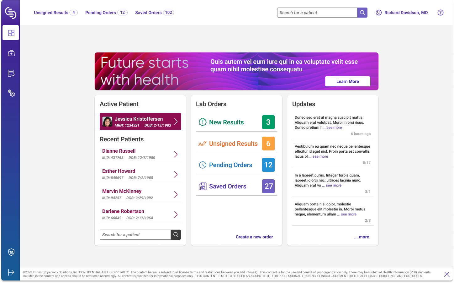
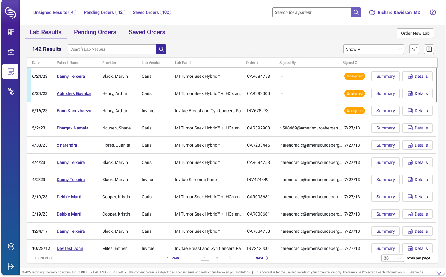
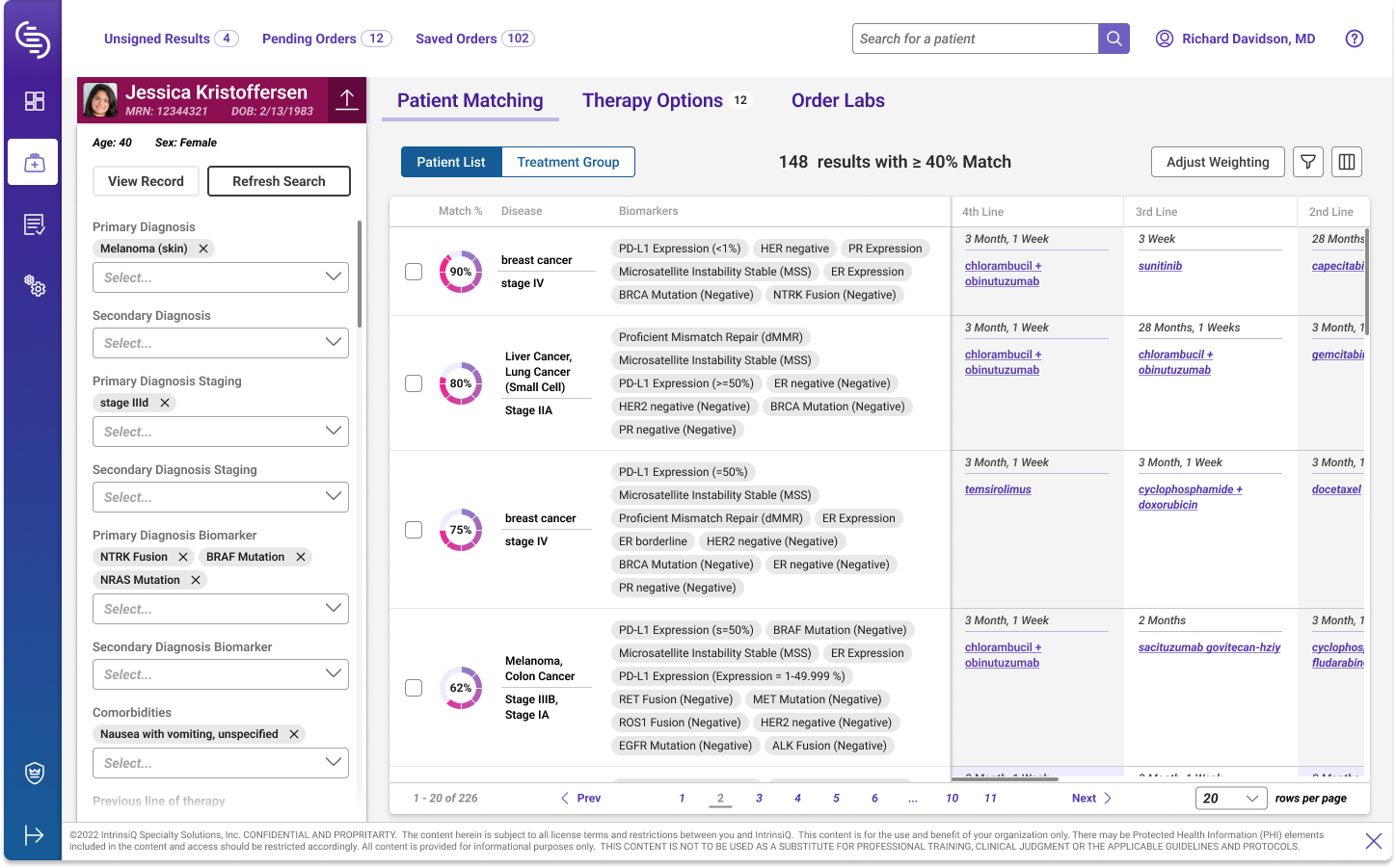
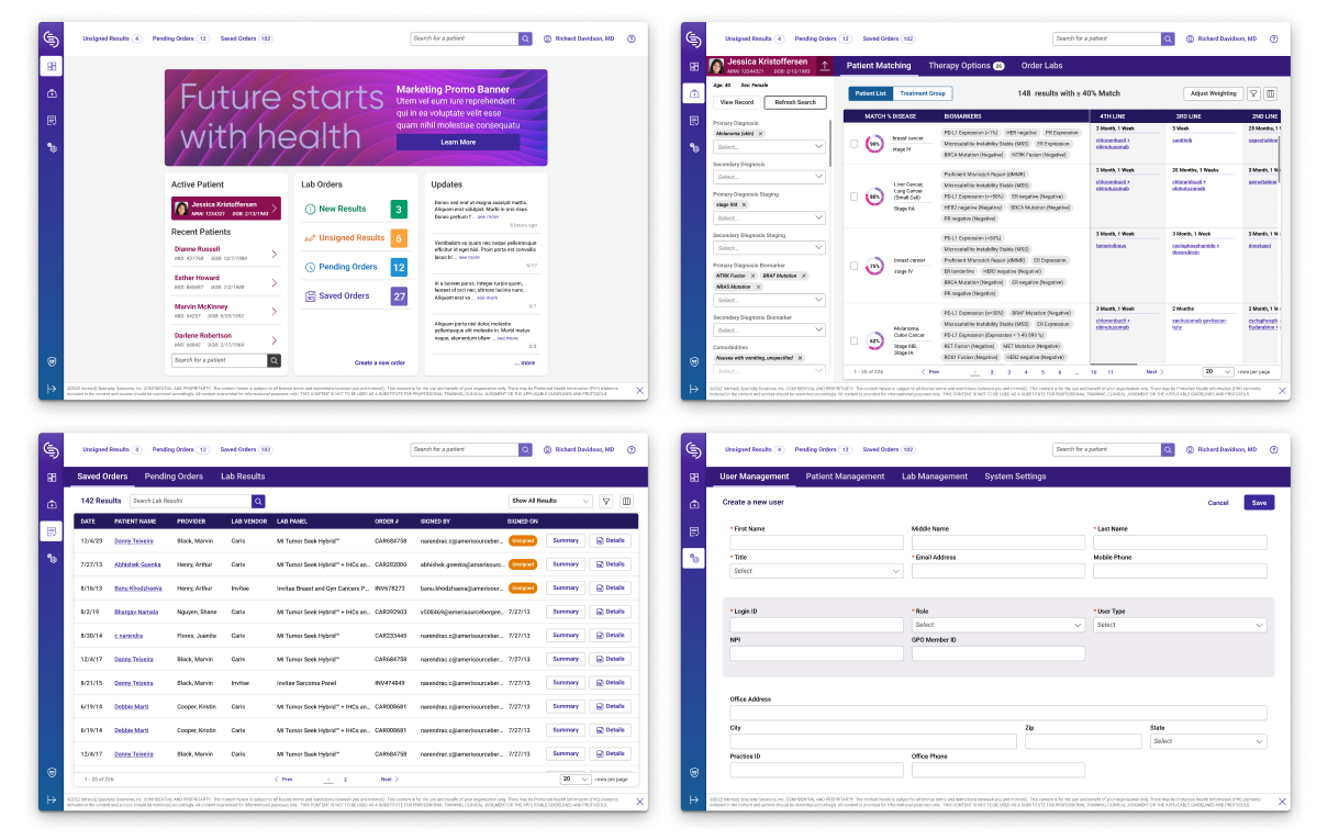
After exploring various color combinations and sharing out design ideas with the team, I delivered over 50 highly designed screens that received very positive feedback from stakeholders and users. I also created a library of common components and added documentation for those components so future designers and engineers would know how to use them consistently. The designs followed the parent companies design system and branding guides, so the application felt more cohesive within the family of applications offered, however I did propose a secondary set of designs that used a rail navigation instead of the design system tab navigation, as I felt it was a more modern experience and allowed for more content per screen.
Sample screens of final designs
Sample screens of rail navigation
Conclusion
During my time with InterinsiQ, significant efforts have led to a transformative enhancement of the user experience for oncologists utilizing the PME software. My collaboration with the project managers, engineers, and oncologists, has resulted in a user-friendly and intuitive interface tailored to the users needs. My efforts to streamline the file organization and establish common design structures immediately resolved internal frustration, and accelerated the development process for engineers through the creation of common components. By identifying solutions to urgent layout issues, simplify processes and create easier to visually understand content, I substantially reduced confusion and boosted the costumers productivity, creating an immediate impact across the board. Followed with my efforts to provide a comprehensive "north star" strategy by update the designs, creating needed documentation and adhering to UX best practices, I have laid the groundwork for seamless advancements in future iterations of the software.
