Refreshing an actively used interface
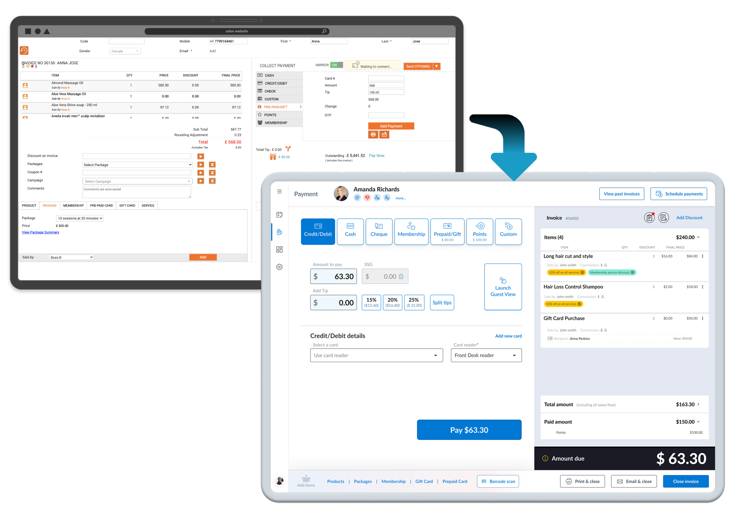
As a billion-dollar company specializing in SaaS products for the health and beauty industry, Zenoti recognized the need for an update to their Point of Sale experience. They sought to make it more modern, user-friendly, and easy to adopt, as the existing system was feature-rich but lacked intuitiveness and felt outdated.
The Challenges:
After nearly 10 years of engineer-focused design, Zenoti asked me to find a way to refresh their Point of Sale (POS) application to feel more modern and user friendly. However, there were several major challenges:
-
An Essential Business Tool: The sales of services and products are critical to the success of a business. Failure to complete a transaction could literally mean the failure of a center.
-
Scattered Information: The content was spread throughout the app without proper Information Architecture (IA), making it challenging for users to find crucial data like payment, guest details, and appointment notes.
-
Resistance to Change: Long-time "old school" users were hesitant to embrace change, knowing the existing system inside out, while new users struggled to grasp the complex interface, requiring extensive training.
-
Brittle Legacy Code: Design choices were constrained by an older code base and developers hesitant to make substantial changes, worried they might affect other parts of the application.
-
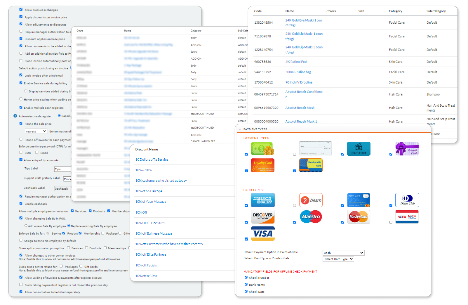
Customization Complexity: Organizations using the Zenoti software suite had the flexibility to customize features and define their own product/service hierarchies, complicating navigation and layout for uncommon flows or transactions.
Large User Base: With thousands of active users relying on the POS application daily, changes needed to be introduced gradually to minimize support tickets and training costs.
The Unique Nature of Point of Sale Systems
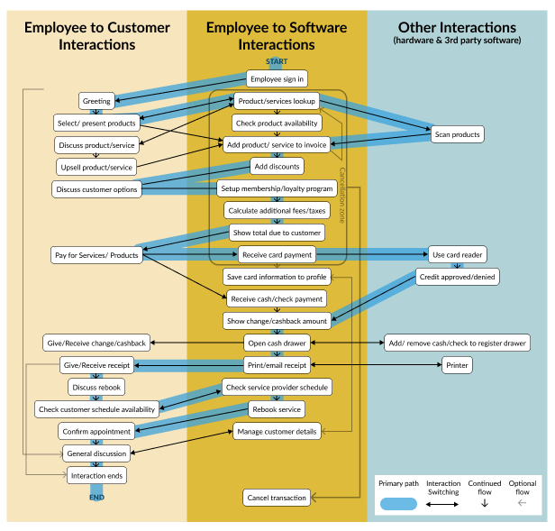
In most applications, the user goal is often achieved within the software itself. For example, setting up an employee schedule is completed entirely within the software from start to finish. But the goal of the POS user is to engage with the customer and process the purchased items or services with as little software interaction as possible. The task is completed successfully if the customer is leaving the center feeling like they were paid attention to. Thus, the software actually can become a hindrance to the users goal.
So when designing the POS, I had to take into consideration the complete off-line context of the user. Front desk employees need to interact with customers, manage queue lines, grab product, talk to the service providers, and interact with third party hardware or software, such as barcode scanners, card readers, or the cash drawer.
Designing for Customization and Complex Flows
The Zenoti POS allowed organizations to customize almost every aspect of the software, leading to diverse and intricate payment flows. Users could search for items by various criteria that may not always be accurately entered, or could drill down through custom hierarchies that may not be easily understood. Organizations also have different methods and policies for applying discounts, defining benefits, and issuing refunds, each requiring specific ways to accomplish the tasks.
This was an actively used and critical product
Another challenge was users needed to use the software multiple times a day to complete transactions quickly, so any changes I made had the potential to confuse the users, causing lost time and potentially lost revenue for the business. This, in turn could create additional support tickets and require additional training time.
The Refresh Process: Incremental Changes
A phased approach
Working with the Product Manager, a phased approach was adopted to help reduce user confusion, and to allow time for the support team to create documentation and provide training.
PHASE 1 - Clean up and Standardize the Existing UI: Initial changes focused on visual improvements of the current UI, such as updated colors, defining consistent components, include touch-friendly sizing, and enhanced spacing and alignment for better layout and responsiveness.
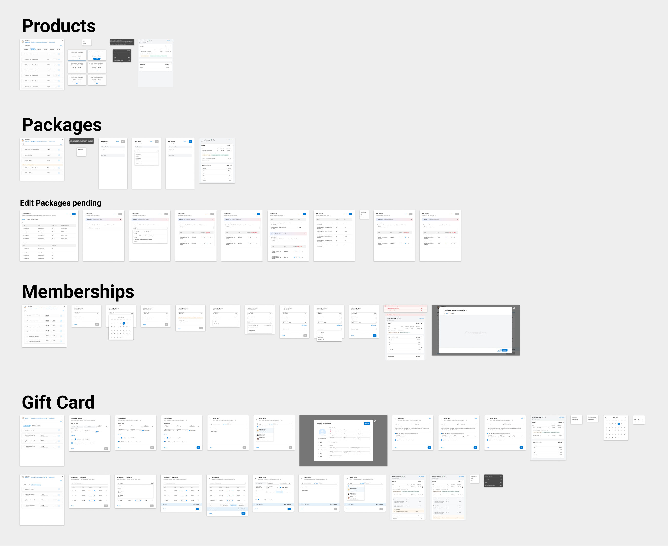
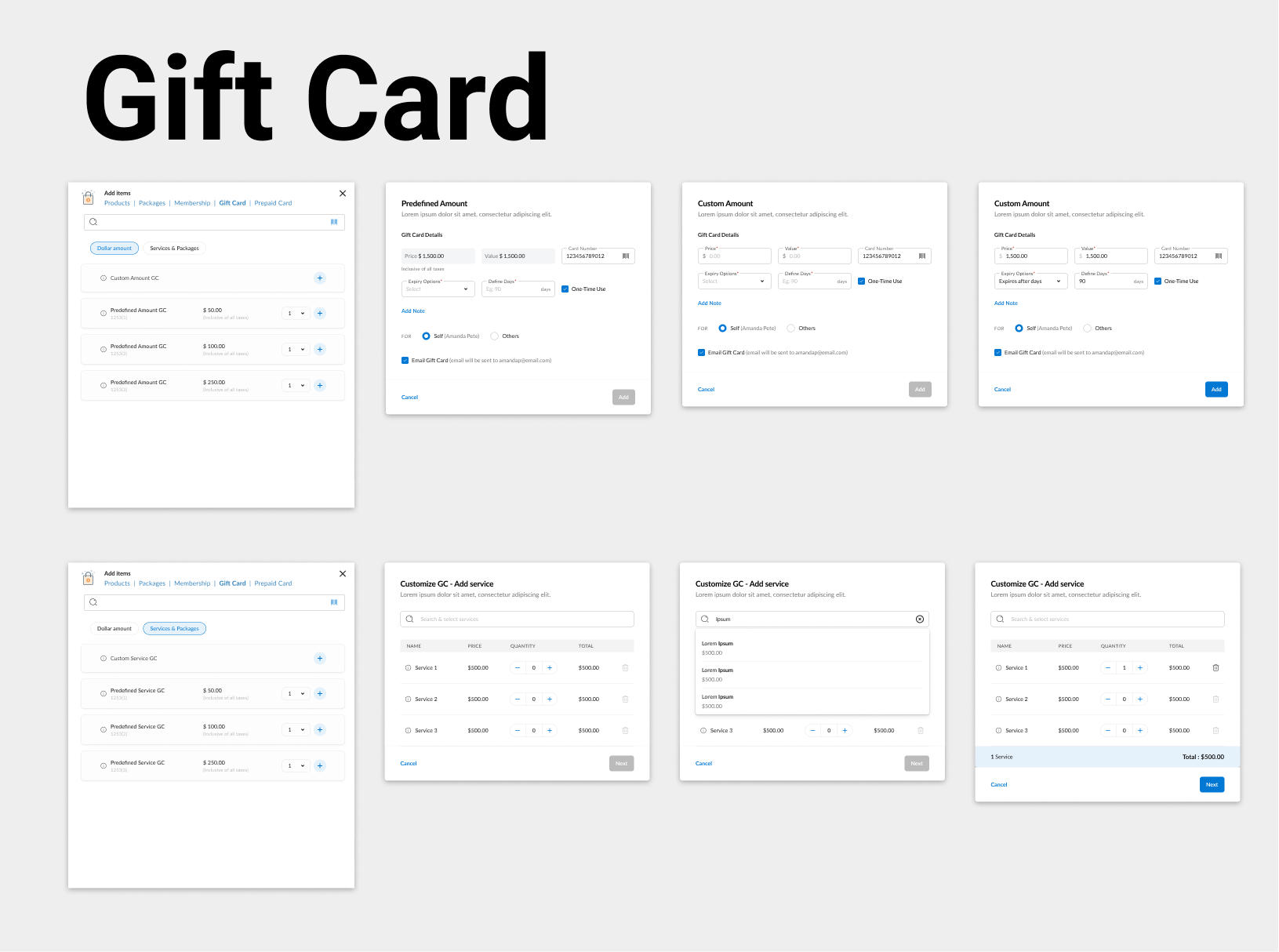
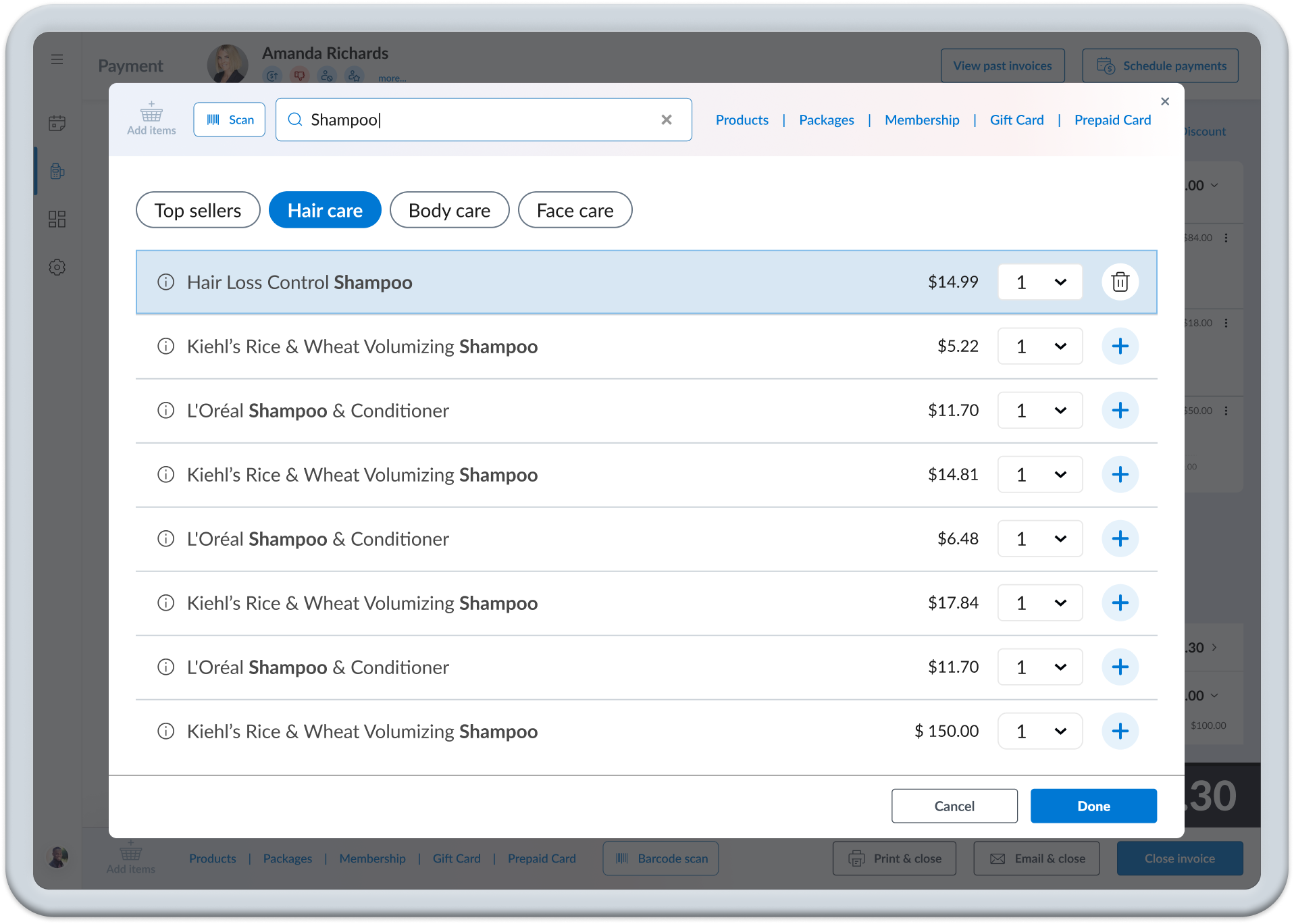
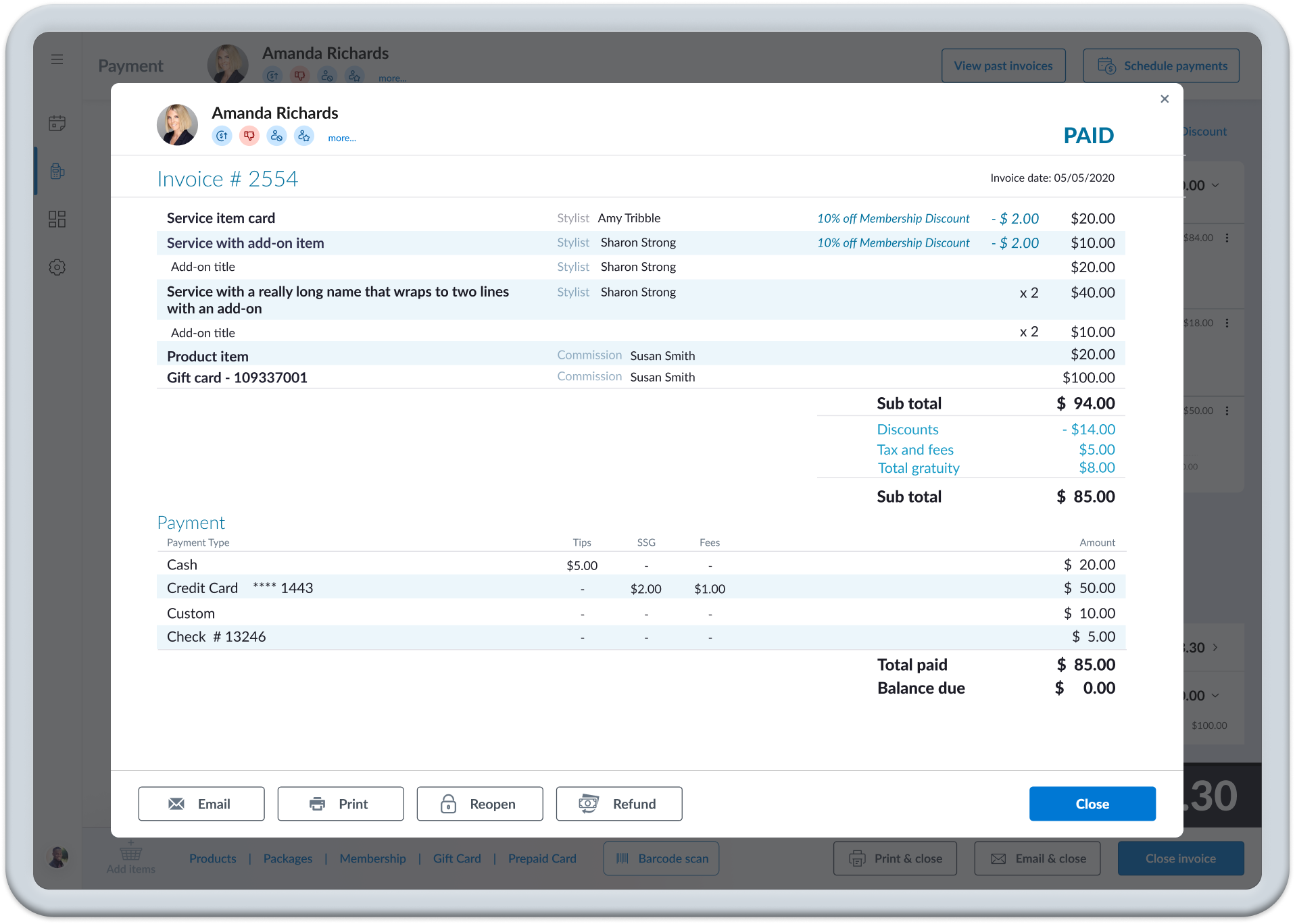
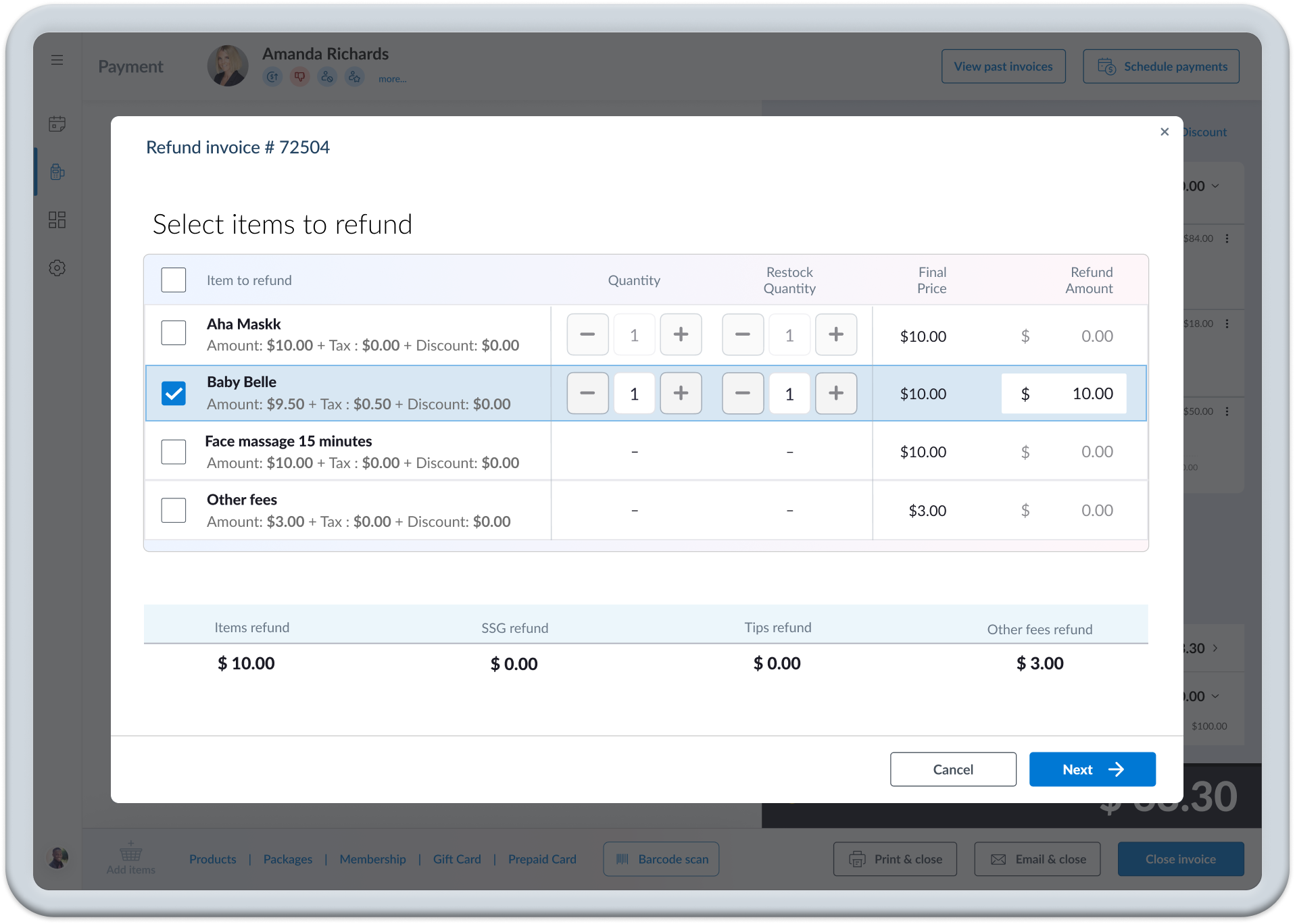
PHASE 2 - Design the Secondary Flows: Addressing issues with the transient actions like adding/removing products, accessing past invoices, and issuing refunds was the next logical step The solution involved utilizing modals heavily for flexibility within the system and allowed us to make improvements with minimal impact to the user and support.
Explore "End Game" design ideas
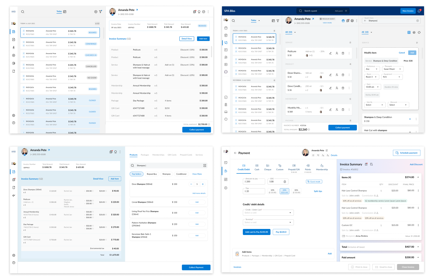
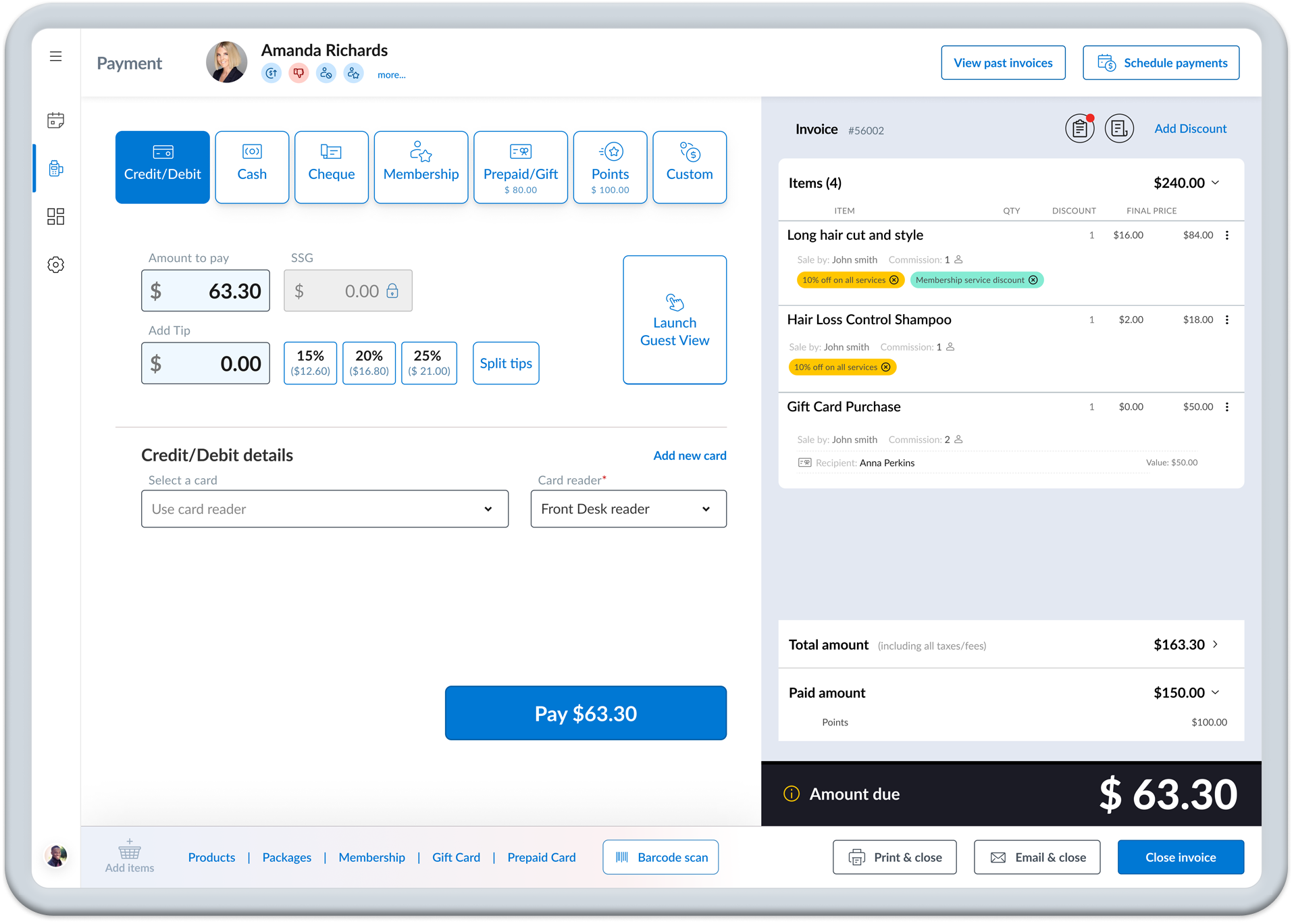
Although phase 2 was focused on the secondary flows involving modals and dialogs, I recognized the importance of establishing an "end game" design to maintain overall consistency. With the goal of keeping the invoice visible while enabling more complex actions, I delved into exploring the use of color blocks and subtle elevations to effectively define content segments.
Refine the ideas
After focusing on fundamental components and visuals, I explored utilizing the column structure to create a smoother work-flow.
Create the secondary flows
The primary sales flow, typically involving credit card or cash transactions, is fairly straightforward. However, the point of sale process encompasses several critical secondary actions. Managing these potential sidetracks efficiently is crucial for a seamless user experience and quick return to the main screen. Therefore, heavily leveraging modals in the application provides the necessary flexibility within the system, allowing for distinct payment policies of various organizations and leaves room for the integration of yet-to-be-discovered future features.
PHASE 3 - Redesign the base application: The last phase was focused on updating the UX and UI of the main application.
Final Results
During the entire process, we rigorously tested various designs to discern which ones resonated with our customers and which ones caused confusion. The outcome was a clean interface featuring two distinct focal areas that users could effortlessly distinguish without any training. Primary functionality remained prominently displayed, while secondary features were strategically placed within modals to facilitate seamless context switching.
Consumer facing interface
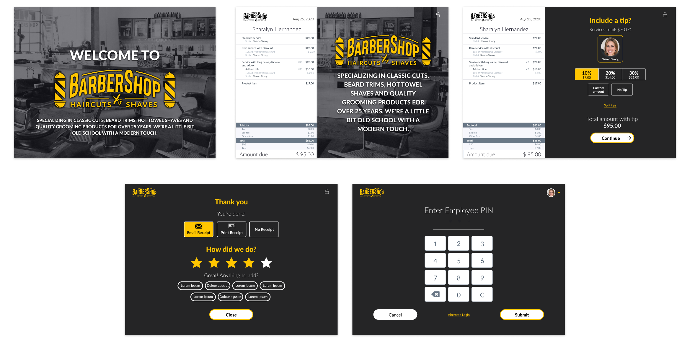
In addition to the POS improvements, Zenoti aimed to provide a consumer-facing work-flow. This screen displayed marketing material, allowed customers to add tips without staff intervention, and provide basic feedback. The challenge lay in ensuring that customers could easily comprehend what was being displayed and perform required actions swiftly. Additionally, the screens needed to be fully customizable to align with each center's unique branding.
Retrospective
This was a long-term project, expected to span several years due to resource constraints and our cautious approach. Striking a balance between Zenoti's business needs and user requirements posed significant challenges for both myself and the product manager. Limited resources, conflicting feedback from users, and the varied demands of stakeholders forced us to make compromises at nearly every step of the journey.
Looking back, I wish I had been more assertive in advocating for the adoption of more modern technology. For instance, the reliance on old data structures, rigid code from other sources and a lack of skilled front-end developers, limited our options considerably. Additionally, I believe having more time for user studies would have shown us ways to significantly reduce the number of secondary flows.
However, the final results were incredibly well-received, and the sales team eagerly promoted the forthcoming changes, sparking excitement among Zenoti's customers for the future.
