Designing and managing a suite of apps from scratch... mostly.
Zenoti is a billion dollar company that focuses on SaaS products for the health and beauty industry. For over a decade, their business model was specific to enterprise and franchise organizations, but they recognized that small businesses, "mom and pop" shops, were a potential missed market. Therefore, a new small business division was created.
My Role
As the first designer in the new division, I was instrumental in the overall planning and execution of this new product. Using knowledge gained from working on the Zenoti enterprise applications, I was tasked to research, design and implement a complete suite of applications that a small business would be able to use to run their business. My responsibilities included user research, industry research, ideation, wire-framing, design, user flows, UI design, design system creation, testing, team management and project oversight.
Understanding small business
Although I had been designing in the industry for a while, I needed to understand what was unique about small businesses compared to the enterprise applications I had been working on. I started with general research that included visiting single-center hair salons, nail salons, barbershops, and massage centers, where I would not only interview and observe but also become a customer to get a sense of the overall experience. Throughout this process, I worked collaboratively with my director and the VP of Small Business, discussing strategies, business desires, and scope. Zenoti spends a lot of money on on-boarding and training for their enterprise applications, which wouldn't be scalable for small businesses, so one of our primary goals with this application suite was to make it self-on-boarding and require minimum user training
Understanding the user
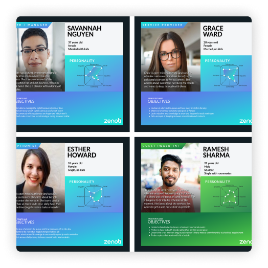
With the initial knowledge gained, I started to compile a list of who our users would be. I created a total of six personas: an owner, a service provider, a receptionist, a walk-in customer, a new customer, and an established customer. Once I felt like I had a few personas in mind, I then utilized the "Jobs To Be Done" method to define an archetype; this helped me understand the multiple roles a single person can play in a small business. For example, the archetype "conductor" helps the overall flow of customers as they experience the center. This conductor role can be played by any employee at any time, so the data around a customer needs to be shared across multiple devices and constantly updated.
Understanding the daily tasks and experiences
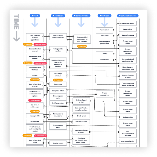
The next step was to understand the daily tasks and experiences of each persona and archetype. For this, I conducted on-location interviews along with internet research to compile a list of daily tasks for the employees and common experiences for the customers. I then compared the list with Zenoti's current enterprise solution to see what existing patterns I could pull from. I also looked for needs specific to small businesses and other potential opportunities. Finally, I overlaid the customer experience, the employee experience, and potential software capabilities into a flow chart, connecting the dots to all daily interactions.
Defining the application functionality
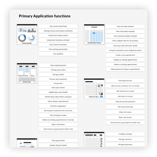
After getting a sense of the overall needs of the users, I then began to group those needs into primary application functions at a high level. This gave us the structure for our primary apps and helped define what the user would do in each app. Following that step, I started to define the information architecture for each application.
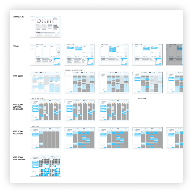
Information architecture - high level and app level
Designing the foundations
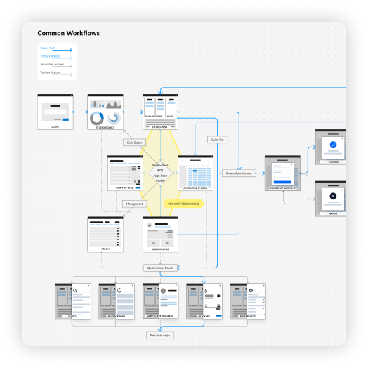
I wire-framed out ideas for how certain flows and functions could be accomplished. I used these wire frames to create a rudimentary click-through prototype which gave us a feel for the potential experience. This allowed us to start designing common work flows and a "happy path."
One insight that came from this research was that an employee, specifically a front desk employee, would jump between scheduling, getting customer details, and taking payments. So we needed to be sure the user could make those jumps efficiently. Another insight was that users dealing with calendars for scheduling had to navigate around calendar days (which were essentially glorified tables), the working hours (which equates to columns), and the employees' schedules (which equates to rows) to locate active customers. They had to do this every time a customer's status changed (from arrival to getting service to completing payment and any other steps along the way). This led to an innovative Kanban-style application that was entirely about the appointments for "today."
With our insights and other learnings, we defined four primary applications: Studio Desk (Kanban board), Calendar (Scheduler), Checkout (Point of Sale), and Guest Book (CMS). The secondary applications were a dashboard and admin tools that included inventory, marketing, employee management, and other management tools.
Mapping out common work-flows between apps and in apps
Growing the team
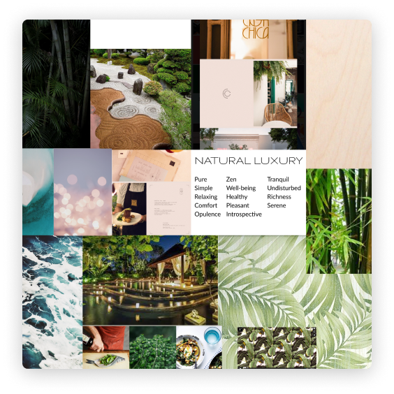
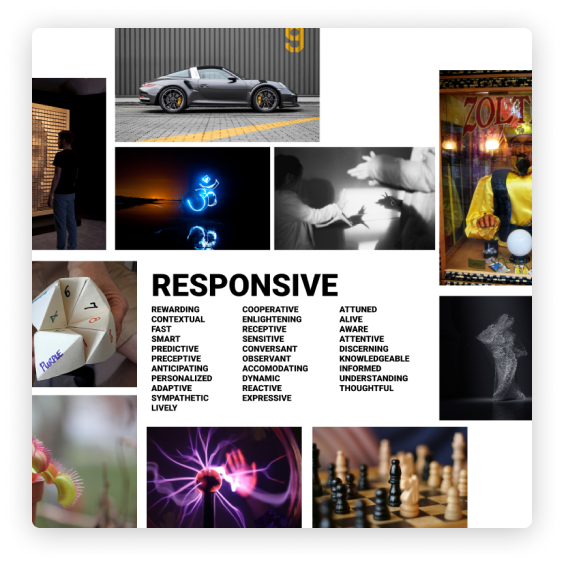
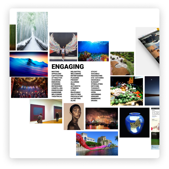
At this point in the process, the small business division brought in more designers. One exciting part of
this new division was that we were allowed to stray from the enterprise application's look and feel and
come up with our own visuals. We collaborated together to come up with various adjectives that we felt
could describe our application; then the designers grabbed a word they liked and built a mood board around
it. After presenting our boards to the team, we settled on "Natural Luxury," but took ideas we liked from
each of them.
The fun begins
As a team, we then started to design various ideas for a UI, focusing around the Studio Desk application. We collaborated multiple times a week; critiquing our various ideas until we saw designs we were drawn to.
Team UI design explorations
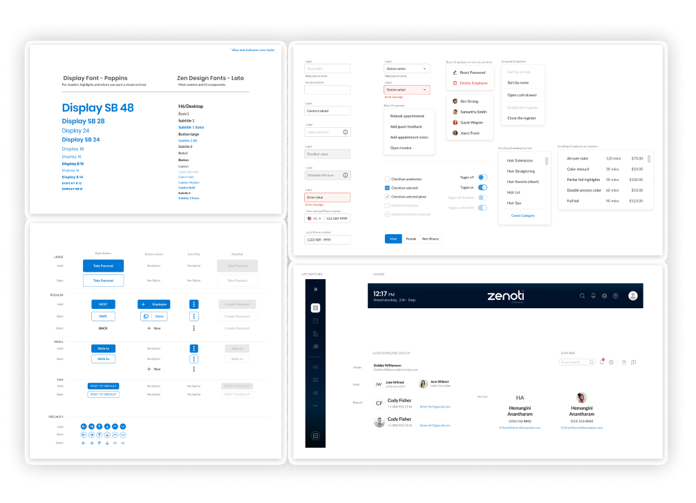
In parallel with the overall screen designs, I also started defining some of the common UI components, exploring various ways to present the data.
Component UI design exploration
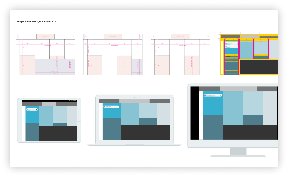
I also explored at how to make the Kanban-style layout be responsive to multiple screen dimensions.
Responsive layouts exploration
Starting production
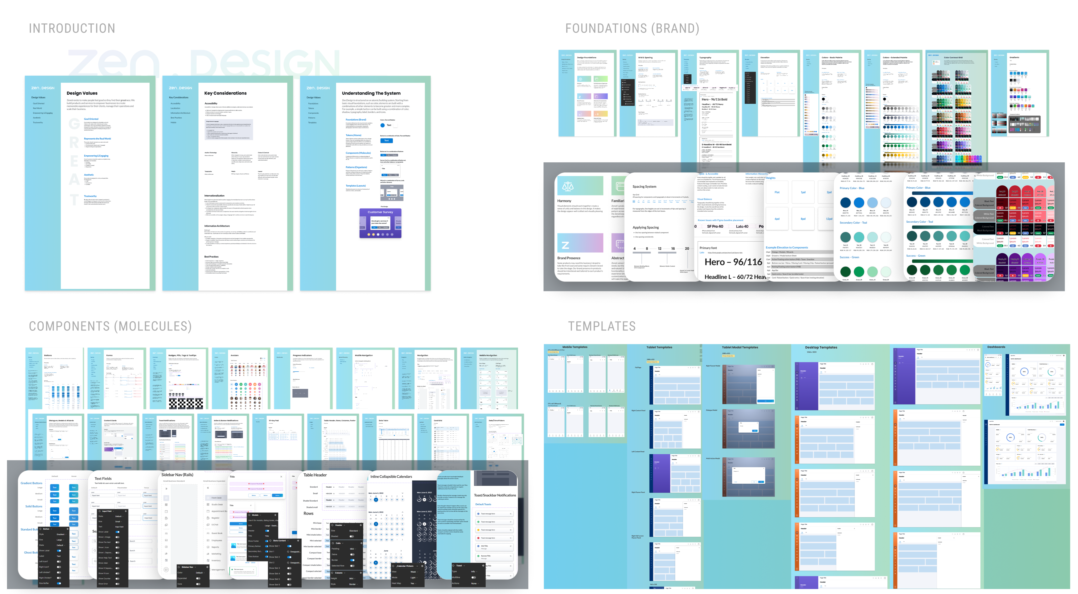
After a few weeks of exploring visuals, we settled on a high-contrast design using color blocks for content areas, and a strong blues to highlight information and important panels. This allowed me to start building out a very rudimentary style guide which were given to the other designers. Responsibilities were divided up among the designers, with me focusing on the Point of Sale, Guest Book, and Studio Desk applications. (I eventually handed the Studio Desk app to another designer to complete.) I also oversaw the designs for the inventory app, employees management app, user on-boarding, and a training module. Over time, I was also able to build out a full design system and component library with over 400 individual components. Things were going well, and the product was starting to take shape.
Challenges
Our team was jiving, the product managers and engineers were all on board, and we seem to be making good headway. Working with product managers, all designers had their own applications that they could design in the way they thought best (with the oversight of myself and my director). However, we soon came across some unexpected challenges.
Challenge 1: Designers are creative
The first challenge was that designers started to stray from the original concepts. Screens were starting to look different from each other even with the style guides and component library in place, and when I gathered the major screens all into a single Figma file, we were able to see the visual inconsistencies and problems with the initial design idea. We noticed that the original dark blue header was very distracting and creating a visual imbalance. We also saw the siderail navigation was getting lost on some of the data heavy screens .
As a team, we evaluated the various ideas and ended up liking several of the newer concepts, including the usage of vivid gradients on important areas and utilizing cards to help organize the content. We adopted these ideas into the overall design and change the way the header, side panels and navigation looked.
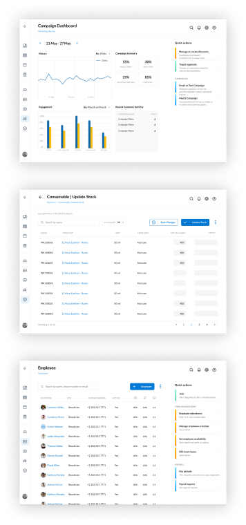
Zenoti enterprise application screens
Challenge 2: "It's going to take how long?"
The second challenge was that Zenoti wanted the product released sooner than our ambitions would allow. So after some discussion, the compromise was to embed some of the existing enterprise applications for management tools such as inventory management, configurations, and marketing. This gave us the functionality we needed but the enterprise designs didn't look like the small business designs. We also weren't allowed to make any major changes to the existing enterprise underlying code. So we had to come up with a way to rework our header and body interface that accommodated the base structure of the enterprise applications with a light re-skin using only CSS and very minor JavaScript changes. The revised structure was carefully adopted throughout the suite of small business tools so there was a common visual language throughout the app.
Final Results
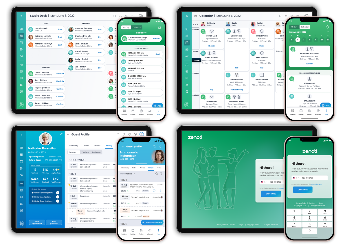
After adopting the colorful gradients, side panels, enterprise headers, and other changes. We put together a beautiful product that was immediately the envy of the rest of the company. Marketing couldn't wait to get their hands on it. During development, I worked directly with the lead engineer to build out reusable and modular Flutter components, and we were able to do a pilot program with a select group of salons. The response was overwhelmingly positive, with absolutely no questions or concerns during the on-boarding process and very little confusion when interacting with the applications.
Sample screens of the delivered project
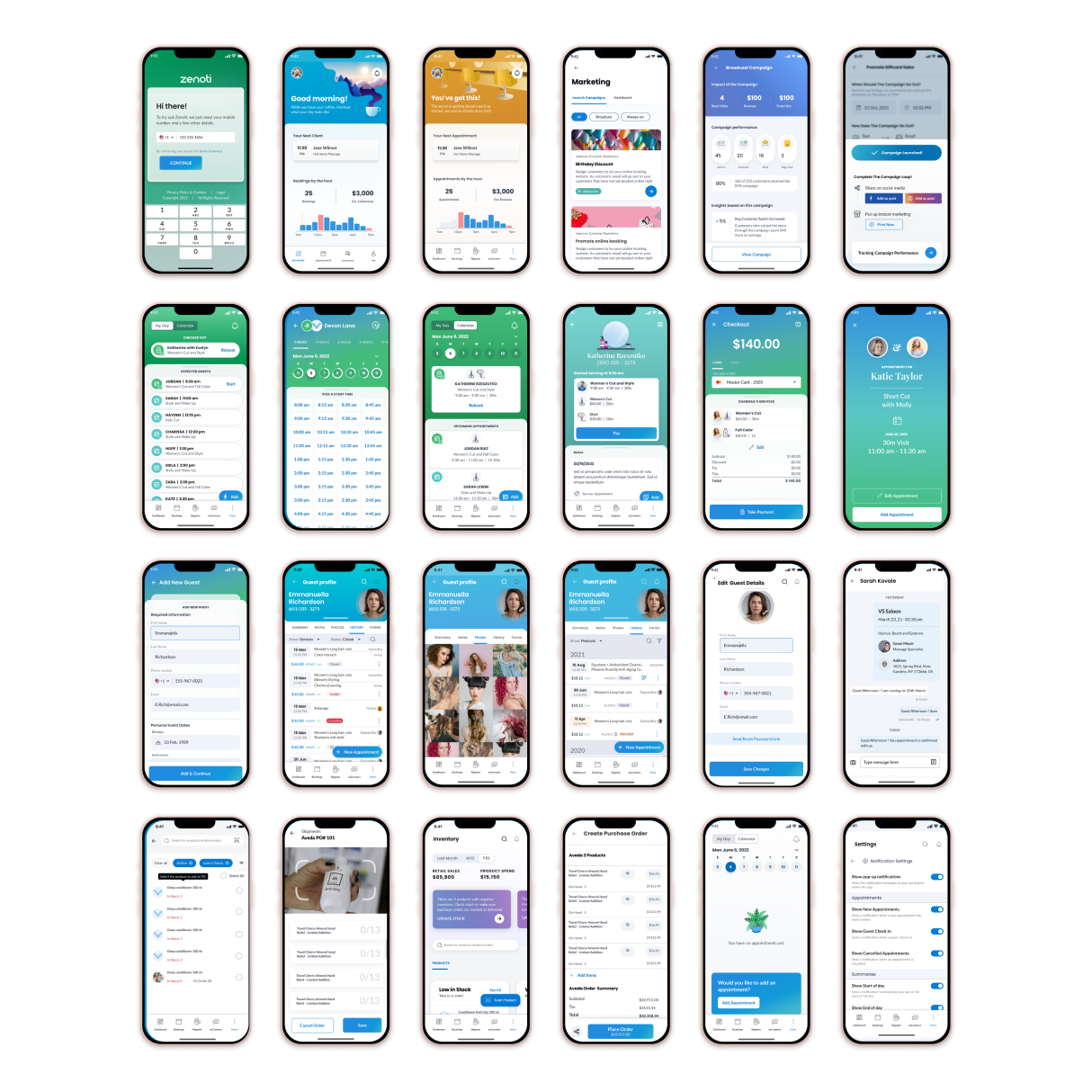
We started the process of developing the mobile experience when a high-level business decision unfortunately shut down the project and the division was dissolved.
Sample screens of the mobile experience
