Creating the
Zen Design System
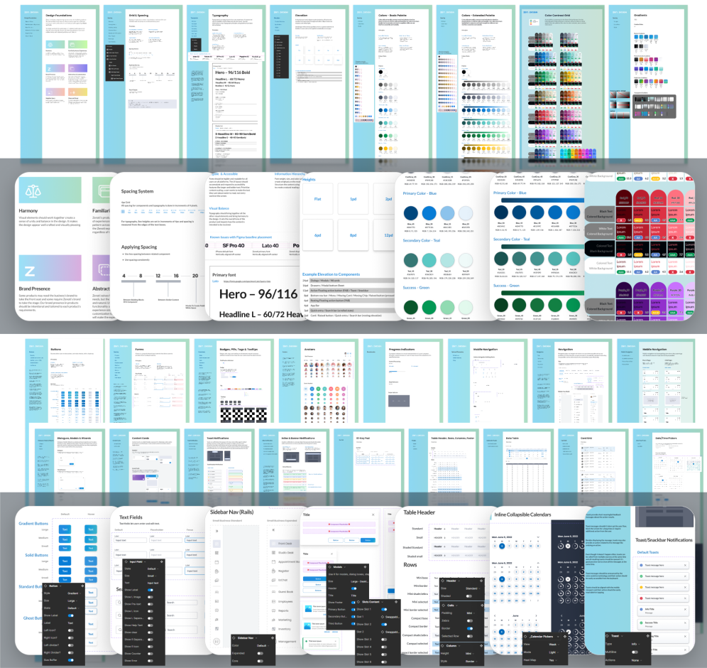
Designing for a large-scale, complex SaaS application like Zenoti required a thoughtful, scalable solution to address inconsistencies and inefficiencies. Initially, Zenoti lacked a unified design system, resulting in fragmented user experiences across its enterprise products. This case study outlines how I conceptualized and built the Zen Design System, which has become the foundation of Zenoti’s product ecosystem today.
The Challenge: From Fragmentation to Consistency
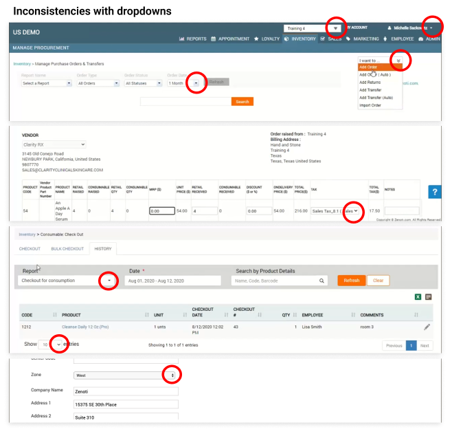
When I joined Zenoti and the lone UX designer, up to that point design decisions were ad-hoc, made primarily by engineers and product managers. Without a cohesive system, glaring inconsistencies emerged—such as dropdown components rendered in different styles across the application—leading to confusion for users and inefficiencies for teams.
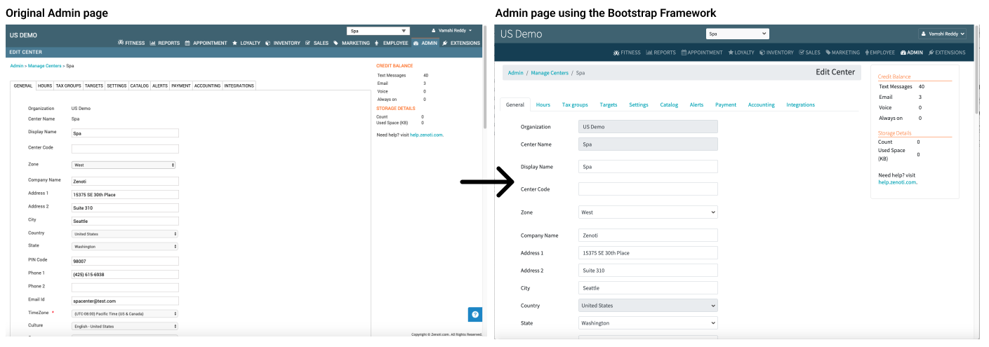
I needed to find an immediate solution to get the products to a base-level consistency both in the visuals as well within the codebase. So I advocated to utilize the Bootstrap Framework for all major components, as there would be minimal engineering overhead and the framework was already established in some parts of the products.
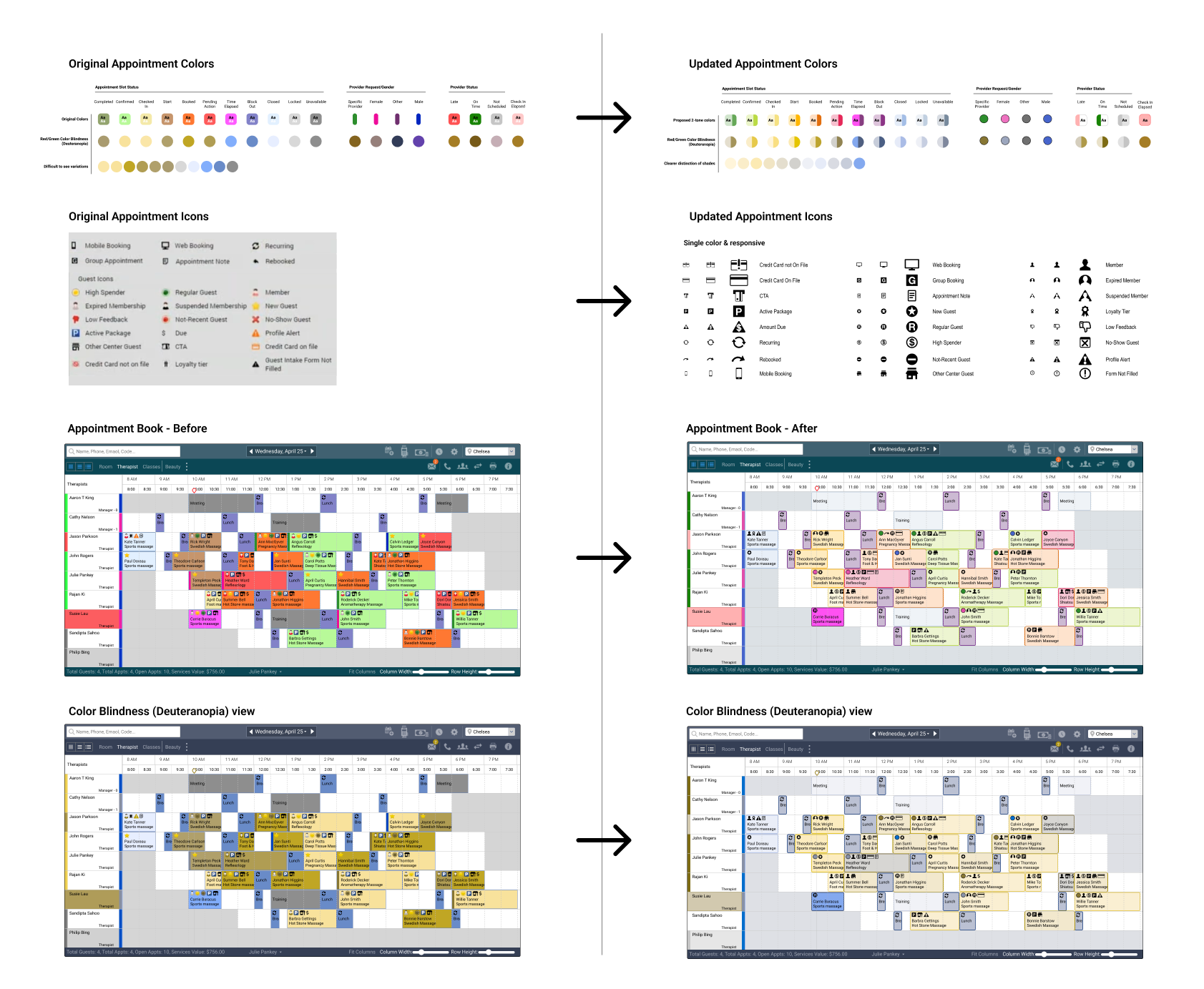
Accessibility was also a critical issue. The flagship front-desk Appointment Book, a core product, received low ratings due to poor color palette options and non-scalable iconography, making it especially difficult for users with visual impairments like red-green color blindness. However a particular challenge with the colors was that each color has a specific meaning (status or characteristic) and Zenoti had some very seasoned users who had learned what the various colors meant, therefore changing the values too much would cause customer complaints and increase support calls. So I had to find colors that had enough constrast to be accessable but stayed within the general hue of the the original.
The Transition: From Quick Fixes to a Scalable Design System
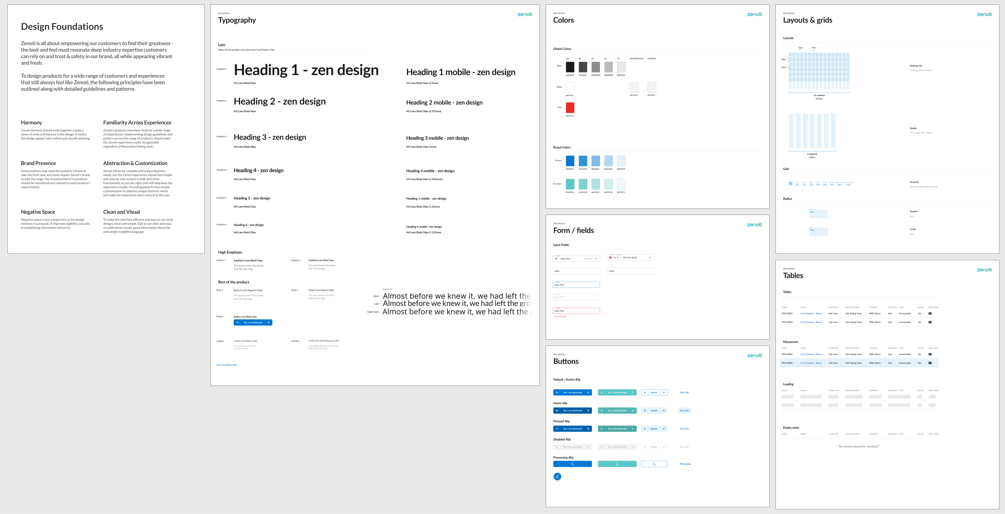
As Zenoti grew and adopted a rebranding initiative, the need for a scalable design system became apparent. This transformation was an opportunity to align all products under one cohesive visual and functional framework. Working with new UX designers and the branding team, I established the foundational principles and started to develop the basics of the Zen Design System.
Design Foundations:
- Harmony: Visual elements should work together create a sense of unity and balance in the design. It makes the design appear well crafted and visually pleasing.
- Familiarity Across Experiences: Zenoti's products have been built for a wide range of experiences. Implementing design guidelines and pattern across this range of products should make the Zenoti experience easily recognizable regardless of the product being used.
- Brand Presence: Some products may need the business's brand to take the front seat and some require Zenoti's brand to take the stage. Our brand presence in products should be intentional and tailored to each product's requirements.
- Abstraction & Customization: Zenoti solves for complex and unique business needs, but the Zenoti experience should feel simple and natural. Use context to hide and show functionality at just the right time will help keep the experience simple. Providing powerful but simple customization to address unique business needs will make the experience seem natural to the user.
- Negative Space: Negative space is just a important as the design element it surrounds. It improves legibility and aids in establishing information hierarchy.
- Clean and Visual: To make the interface efficient and easy to use, keep designs clean and simple. Opt to use clear and easy to understand visuals, good information hierarchy and simple insightful language.
Scaling the System
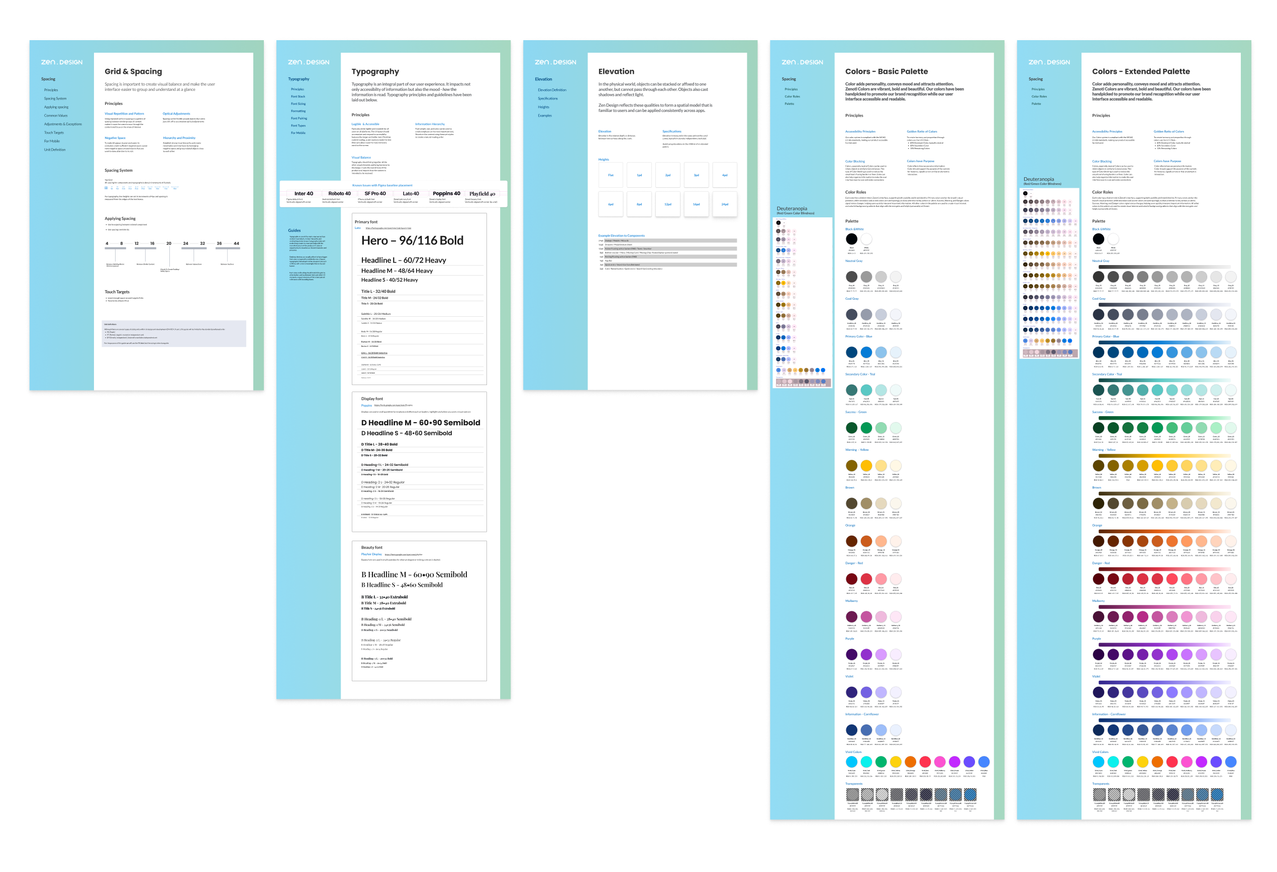
I continued to define more of the foundations as I started to inventory the different colors, layouts, fonts, components, and workflows all the products offered. Eventually developing a robust set of complementary font styles, elevations, 4px grid system, and colors that adhered to WCAG accessibility standards.
With the foundations in place, I researched methodologies to determine the best way to scale the larger design system. I specifically looked at Object-Oriented UX (OOUX), Modular Design Systems and the Atomic System.
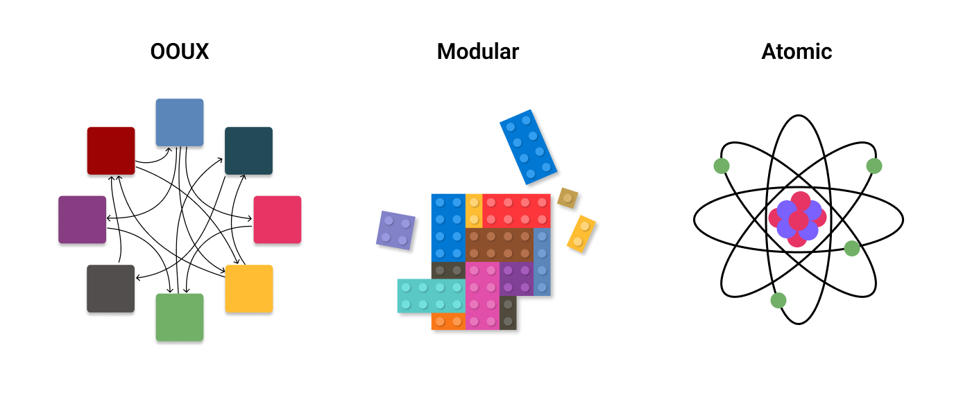
Initially, I was drawn to Object-Oriented UX (OOUX) because of its focus on user workflows in a relevant way. However, I quickly realized that mapping out everything Zenoti offered would be overwhelming and impossible to execute meaningfully within a reasonable timeframe on my own.
Modular Design, on the other hand, aligned closely with how Zenoti was already building its products. It provided a foundation for consistency across products, particularly when strong relationships existed between modules. However, I found it limiting in scalability due to the unique cases within Zenoti's ecosystem. Changes made to one object or module often created unintended ripple effects across multiple applications, which required significant management overhead—resources I simply didn't have. Additionally, there was ambiguity around handling smaller components that didn't clearly belong to a specific object or module.
Atomic Design offered a structured approach, enabling creativity within the system's boundaries and simplifying maintenance. Yet, it could sometimes become overly granular, abstracting components to a level that wasn't always necessary or practical.
Ultimately, I adopted a hybrid approach, pulling ideas from all three methodologies to suit Zenoti's needs. This hybrid structure supported both how the products were designed and how they were built, while remaining scalable and adaptable. It formed the basis of a hierarchical system that balanced foundational principles with flexibility.
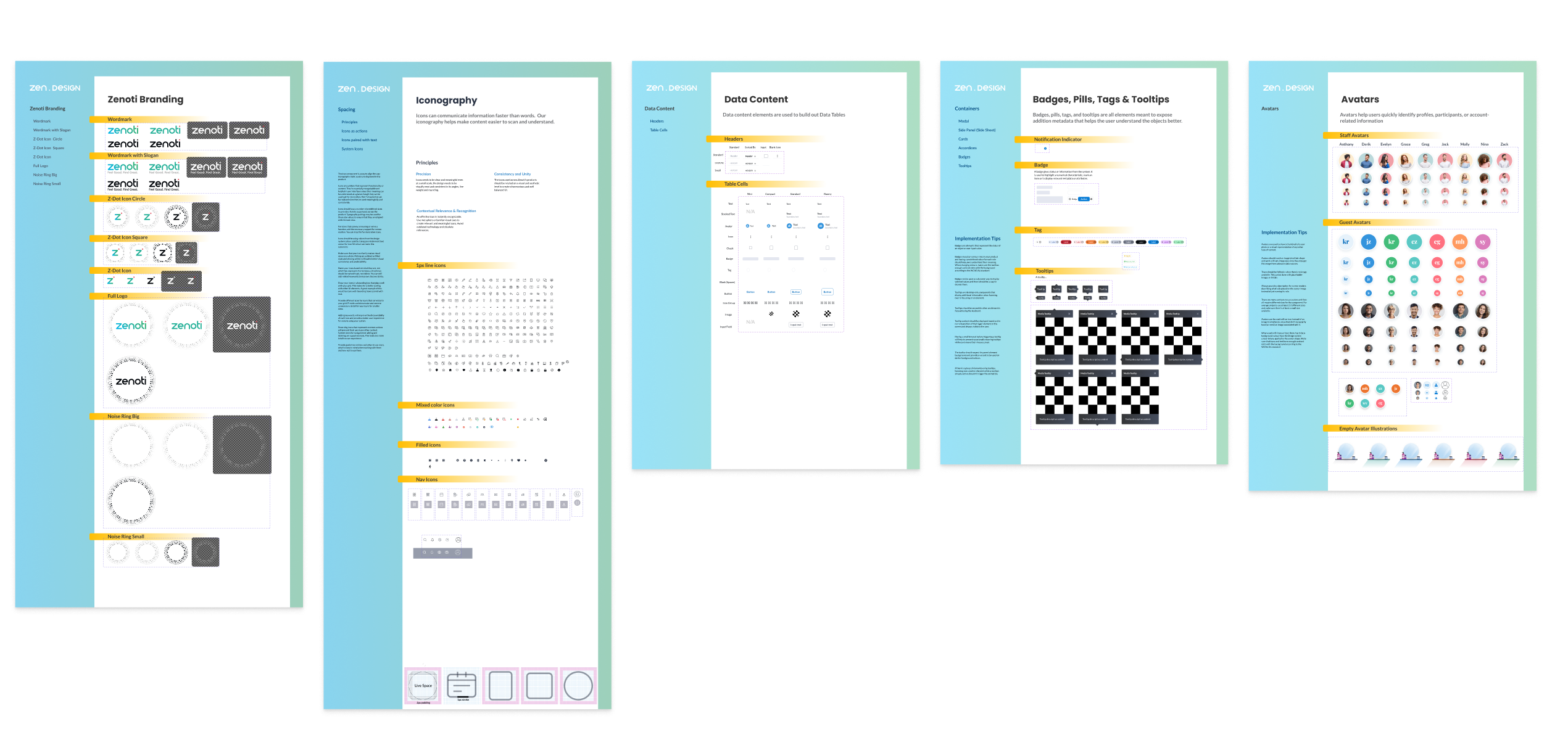
Elements: The smallest components, usually placed within other components.
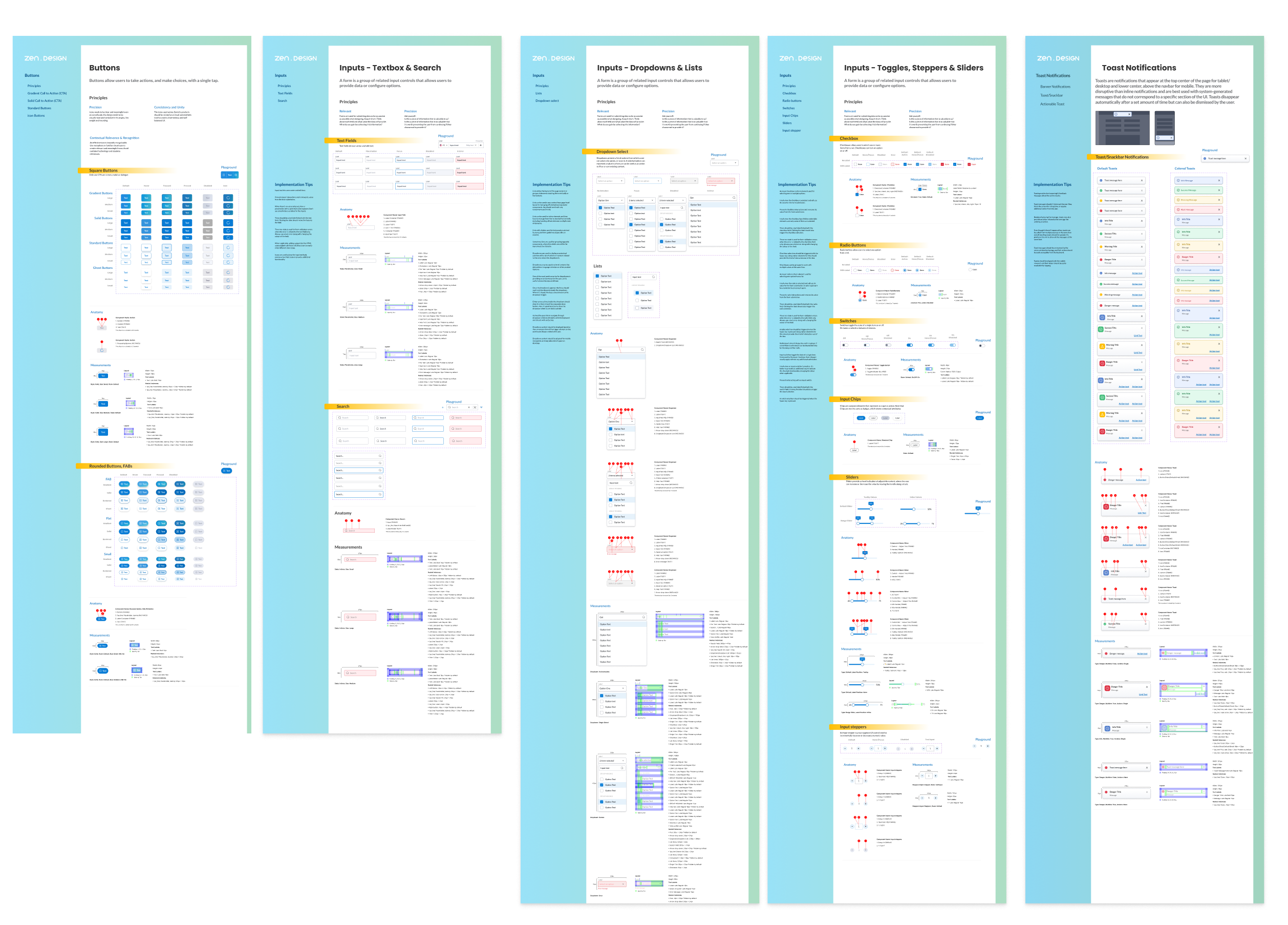
Components: Commonly used objects like buttons, cards, and inputs.
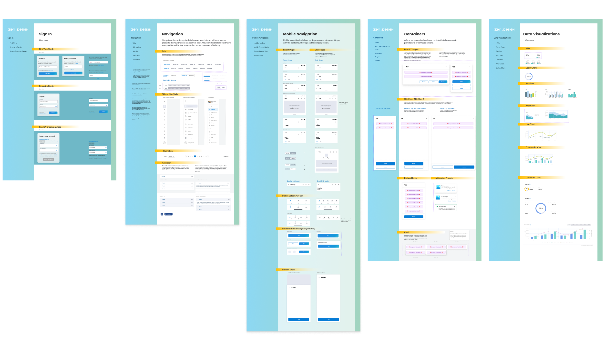
Patterns: Larger modules addressing complex user needs like navigation and modals.
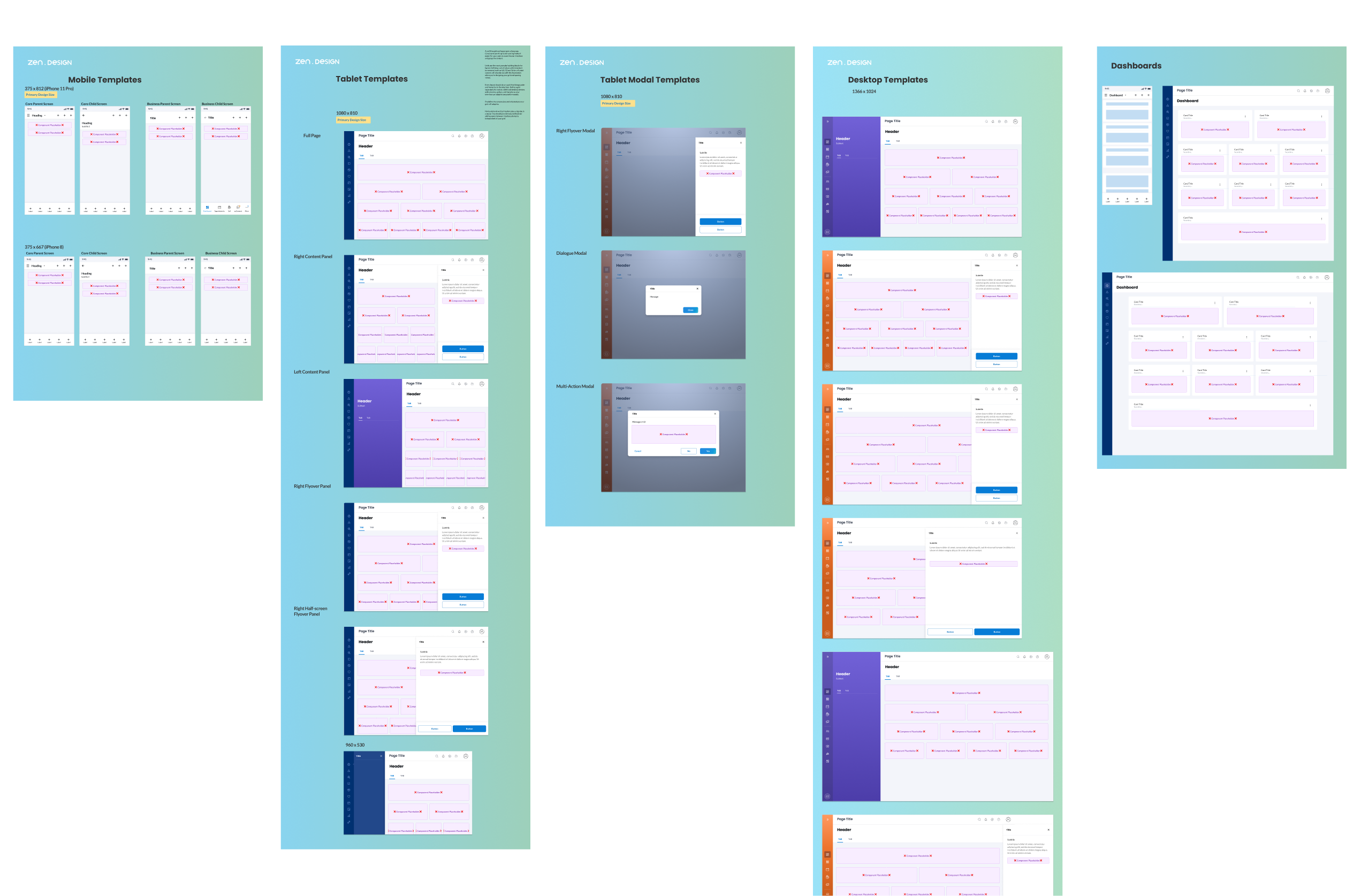
Templates: Preconfigured responsive layouts for rapid prototyping.
A note on "Slots"
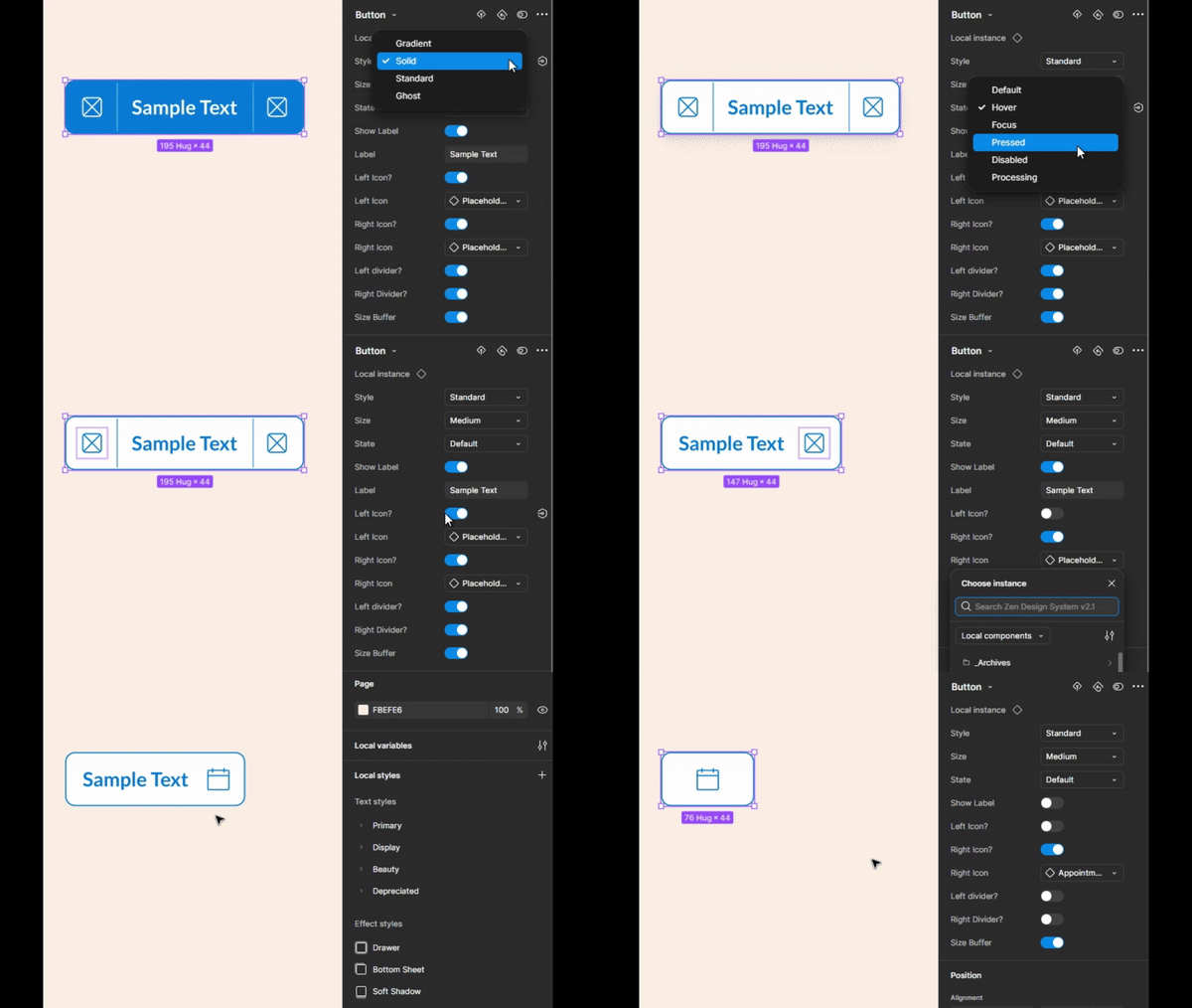
While building out the components, I learned about a method of creating a placeholder component that allows the designer to swap out with other component instances. I adopted this method early on in the process, creating compatible components and patterns which allowed for very quick design creation.
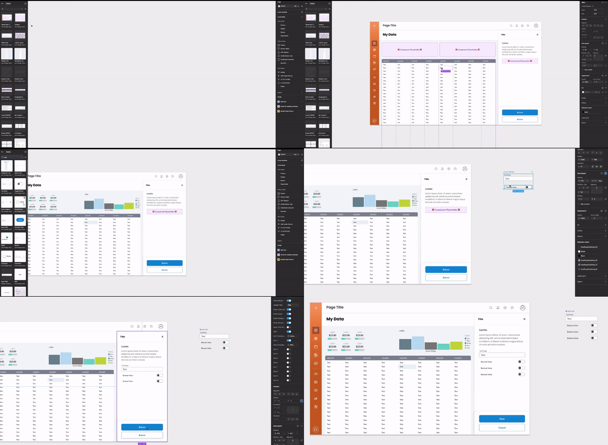
Allowing for multiple design needs
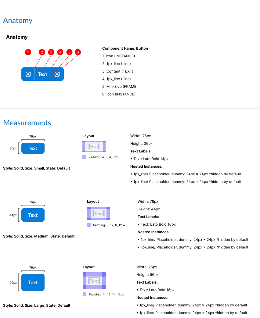
Utilizing the power of Figma's variants feature (which was new at the time), every component had the various states and visual variations needed. I also created basic documentation addressing the anatomy and structure of each component.
Results and Impact
The Zen Design System fundamentally transformed how Zenoti designs and develops its products. Key outcomes include:
- Improved Consistency: Unified UX/UI across products, enhancing usability and trust.
- Enhanced Accessibility: Compliance with WCAG standards, significantly improving user satisfaction.
- Efficiency Gains: Streamlined design-to-development workflows, reducing production time for new features.
By providing a scalable, user-focused framework, the Zen Design System continues to evolve, enabling teams to deliver cohesive, accessible, and visually compelling products across Zenoti’s enterprise ecosystem.
Thanks for reading
DRAFT 1.2
